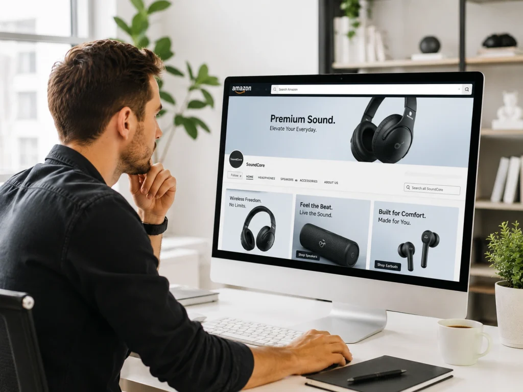
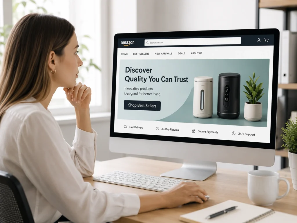
Most shoppers decide in seconds whether to stay or leave the storefront. On Amazon, attention is short, and competition is intense. Your storefront banner is no longer just a visual at the top.
We have seen this mistake cost sellers more than ads or weak listings. From experience, your banner can pull shoppers in or push them out in seconds.
It is your first chance to make an impression. If the banner looks cluttered, outdated, or unclear, most shoppers will not explore.
This is where mistakes in Amazon storefront banner design impact performance. Your storefront is one of the few places your brand gets focus without distractions.
Many sellers treat banners as decoration rather than as a strategy. Poor visuals, too much text, and weak branding reduce trust and conversions.
Why Poor Amazon Storefront Banners Hurt Sales
Every click you buy costs a piece of your profit. When a shopper lands on your page, they ask a silent question. “Does this brand look like they know what they are doing?” If your banner looks cheap, the answer is a hard no.
Think about the psychology of a scroll. A shopper clicks a Sponsored Brand ad because they saw something they liked. They arrive at your store expecting a premium experience. When the banner fails to deliver, they bounce. This section breaks down why these design choices affect your bank account directly.
Mathematics does not lie. A high exit rate means you are paying for visitors who do not stay to see your products. To make sure your traffic isn’t wasted, expert ads campaigns must be paired with high-converting storefront visuals to maintain a healthy ROAS.
Metric | The Standard Store | The Optimized Store |
Exit Rate | High (Above 60%) | Low (Below 35%) |
Time on Page | 10–15 Seconds | 45+ Seconds |
Unit Session % | 2% – 3% | 8% – 12% |
Why does this happen so often? Usually, it starts with technical errors that could have been avoided in minutes.
Category 1: Not Following The Best Amazon Storefront Banner Sizes and Layout Rules
We live in a world of high-definition screens. Most mobile phones now carry 8K resolution displays. If your image is even slightly blurry, you look like a ghost from 2010. People do not buy from ghosts. They buy from brands that feel sharp and modern.
Mistake #1: Ignoring High-Density Resolution Standards
Your images must be crisp enough to cut glass. Using low-resolution files is one of the biggest Amazon storefront banner design mistakes you can make today.
When a shopper zooms in on a mobile device, they should see every detail. Investing in premium product photography for Amazon makes sure your assets meet the high-density standards required for 4K and 8K displays.
Asset Type | Optimal Pixels | Aspect Ratio |
Hero Banner | 3000 x 600 px | 5:1 |
Square Tile | 1500 x 1500 px | 1:1 |
Shoppable Tile | 1500 x 750 px | 2:1 |
High resolution builds immediate brand trust. It shows you are a real player in your niche.
Mistake #2: The "UI Overlap" Error: Obscured CTAs and Text
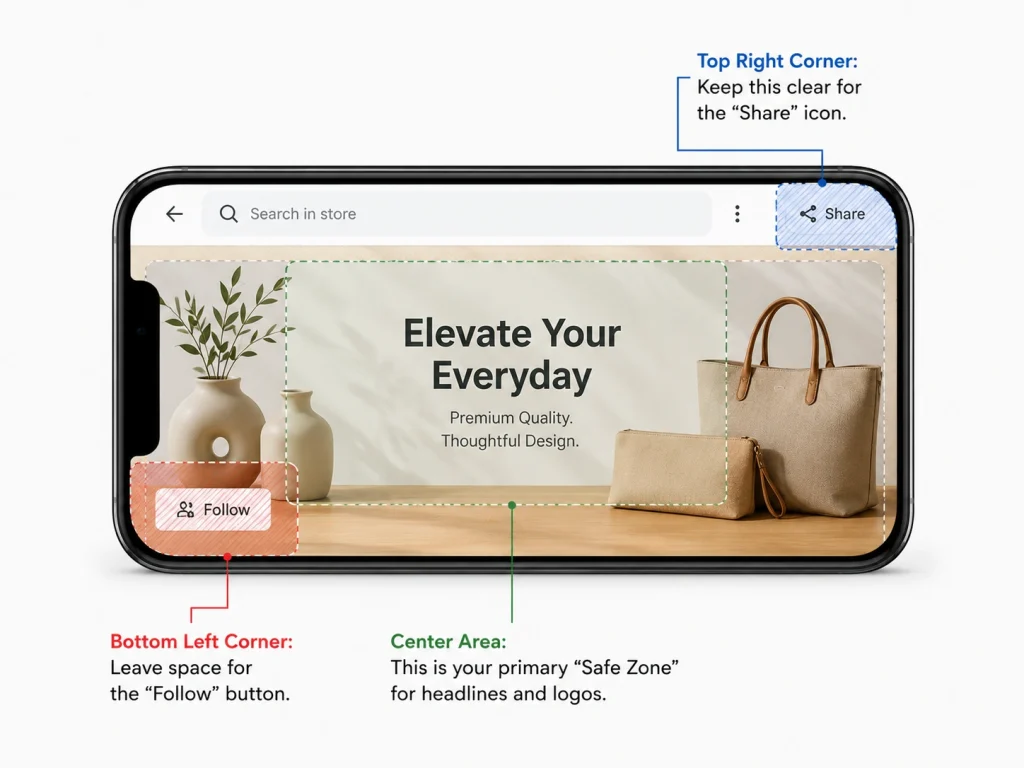
Amazon places its own buttons on top of your banner. They put the “Follow” button in a specific corner. They put a search bar near the top. If your main headline sits under these buttons, no one can read it.
Silent. Broken. Messy. That is how a banner feels when the interface covers the message. You must design with the “Safe Zone” in mind. This means keeping your text away from the edges where Amazon might overlay navigation icons.
- Top Right Corner: Keep this clear for the “Share” icon.
- Bottom Left Corner: Leave space for the “Follow” button.
- Center Area: This is your primary “Safe Zone” for headlines and logos.
Category 2: Mobile Design Mistakes in Amazon Storefront Banners
Most people shop on their phones while they are standing in line or sitting on a bus. They do not see your store the way you see it on your big office monitor. If you design for desktop first, you are ignoring 80% of your customers.
Mistake #3: Designing for Desktop and "Auto-Scaling" for Mobile
The Amazon app does something very specific. It crops the sides of your wide desktop banner to make it fit a narrow vertical screen. If your product is sitting on the far right of the image, it disappears on mobile. This kills your conversion rates because the shopper no longer sees what you are selling.
Think about the “Thumb Zone.” Shoppers use their thumbs to scroll down the page. Your most important information should be dead center. Go through this checklist for mobile viewport readiness:
- Is the product visible in the center 60% of the image?
- Does the background remain clean when the sides are cut off?
- Can a user see the brand logo without needing a magnifying glass?
Mistake #4: Micro-Typography and Font Contrast Failures
Small text is a death sentence for your sales. If a shopper has to pinch their screen to read your offer, they will simply swipe away. They do not have the patience to work for your information.
Simple words work best. Large, bold fonts are your friends. You should use at least 18pt font for any text inside a banner. Also, check your contrast. White text on a light gray background is impossible to read when someone is standing outside in the sun.
Category 3: Visual Authority and Brand Trust
Shoppers can smell a fake from a mile away. In 2026, people want to see real products in real environments. They want to feel the texture of the material or the weight of the tool through the screen.
Mistake #5: Generic AI Images vs. Authentic Lifestyle Photography
AI is everywhere now. But bad AI looks robotic. It looks cold and slightly “off.” Customers want lifestyle photography that feels warm and human. They want to see how your product fits into their actual life.
Using “Uncanny Valley” AI renders is a massive mistake. It makes your brand look like it doesn’t actually exist. Real photos build brand trust. They prove that you have a physical product that real people use. Check out the signs of high-trust visuals:
- Natural lighting that matches the indoor or outdoor setting.
- Real people showing genuine, unforced emotions.
- Close-up shots that show the quality of the materials.
Mistake #6: Chromatic Inconsistency: The Disconnected "Color Story"
Does your hero banner match the tiles below it? If the top of the page is a soft blue and the bottom is a jarring neon red, the experience feels chaotic. This is called “Visual Noise,” and it makes shoppers feel anxious.
Your Amazon storefront should have a consistent “Color Story.” Pick three main colors that represent your brand. Use them throughout the entire page. This makes the shopping experience feel smooth and professional. It makes the customer feel like they are in a real boutique.
Category 4: CTA Mistakes That Reduce Amazon Storefront Clicks
A pretty banner is nice to look at. A banner that sells is even better. You need to tell the shopper exactly what to do next with a clear directive.
Mistake #7: The Vague CTA: Why "Shop Now" is Wasting Space
“Shop Now” has become white noise. Everyone says it. It doesn’t give the customer a reason to click anymore. You need a high-conversion CTA that speaks to a specific benefit or a feeling.
Instead of “Shop Now,” try phrases like “Upgrade Your Morning” or “Experience the Comfort.” These words promise a result. They improve your click-through rate because they spark an emotional response.
Generic CTA | High-Performance CTA |
Shop Now | Discover Your Perfect Fit |
See More | Explore the Lastest Collection |
Buy Today | Start Your 30-Day Change |
Mistake #8: Storefront Navigation Mistakes That Increase Bounce Rate (Failing to Use Deep Linking)
A hero banner should never be just a static image. It should be a doorway. If a shopper clicks your beautiful banner and the page just refreshes, they get frustrated.
Each banner must link to a specific sub-page or category. If your banner features your new line of waterproof jackets, it must link to the “Waterproof Jackets” page. This is a core part of a smart storefront optimization strategy. It keeps the customer journey moving toward the “Add to Cart” button.
Category 5: Amazon Storefront Banner Copywriting Mistakes
Words are powerful. But on Amazon, some words are forbidden. If you use the wrong language inside your graphics, Amazon might reject your store or even take it down.
Mistake #9: Policy Violations: Prohibited Claims and Time-Sensitive Text
Do not put “Best Seller” in your banner. Do not put “5-Star Rated” in the image itself. Amazon hates this because ratings and rankings change every day. If your image says you are a best seller but your rank drops tomorrow, you are misleading the customer. To avoid these pitfalls, a reliable account management is essential to keep your Amazon account in good standing. Here is a checklist of banned words for storefront banners:
- “Best Seller” or “#1”
- “Free Shipping” (Amazon considers this their feature, not yours)
- “Discount” or “Sale” (Use the dedicated platform badges for this)
- “Money-Back Guarantee”
Mistake #10: Headline Clutter: The "5-Word Rule" for Hero Units
You have about three seconds to catch someone’s eye. If your banner looks like a book page, it will be ignored. This is where the “5-Word Rule” comes into play.
Try to keep your main headline to five words or fewer. “The World’s Softest Bamboo.” “Performance That Never Stops.” These are punchy. They stick in the mind. Avoid clutter at all costs to keep the focus on the product.
Category 6: Data-Driven Optimization Gaps
A great store is never truly “finished.” If you build it and leave it alone for a year, you are leaving money on the table. The Amazon market moves too fast for a “set it and forget it” mindset.
Mistake #11: Ignoring Seasonality and Real-Time Event Trends
Seeing a winter banner in the middle of July feels lazy. Customers notice these things. If you don’t update your store for Prime Day or the holiday season, you look out of touch with the market.
You should have a banner rotation plan ready to go. Change your hero image at least four times a year. This keeps the store fresh for people who buy from you again and again. Below you will a 12-Month Banner refresh calendar:
- Q1: Focus on fresh starts and new year resolutions.
- Q2: Spring cleaning and outdoor preparation.
- Q3: Prime Day and back-to-school themes.
- Q4: The massive gifting season and holiday cheer.
Mistake #12: Scientific Failure: Not Using "Manage Your Experiments" (MYE)
Stop guessing what looks good. Start testing what actually sells. Amazon has a built-in tool called “Manage Your Experiments.” It lets you show two different banners to different groups of shoppers. Then, it tells you which one actually made more money.
Testing is the only way to truly solve Amazon storefront banner design mistakes. Maybe your customers prefer a lifestyle shot over a product render. Maybe they like a blue background more than a white one. Let the data tell you the truth.
Amazon Storefront Banner Design Mistakes can make your brand look unprofessional and reduce buyer trust. BrandsBro helps fix banner layout, visuals, messaging, and mobile readability.
Need a better Amazon storefront? Book a free meeting and let’s improve your banner strategy.
Amazon Storefront Banner Case Study: Higher CTR After Redesign
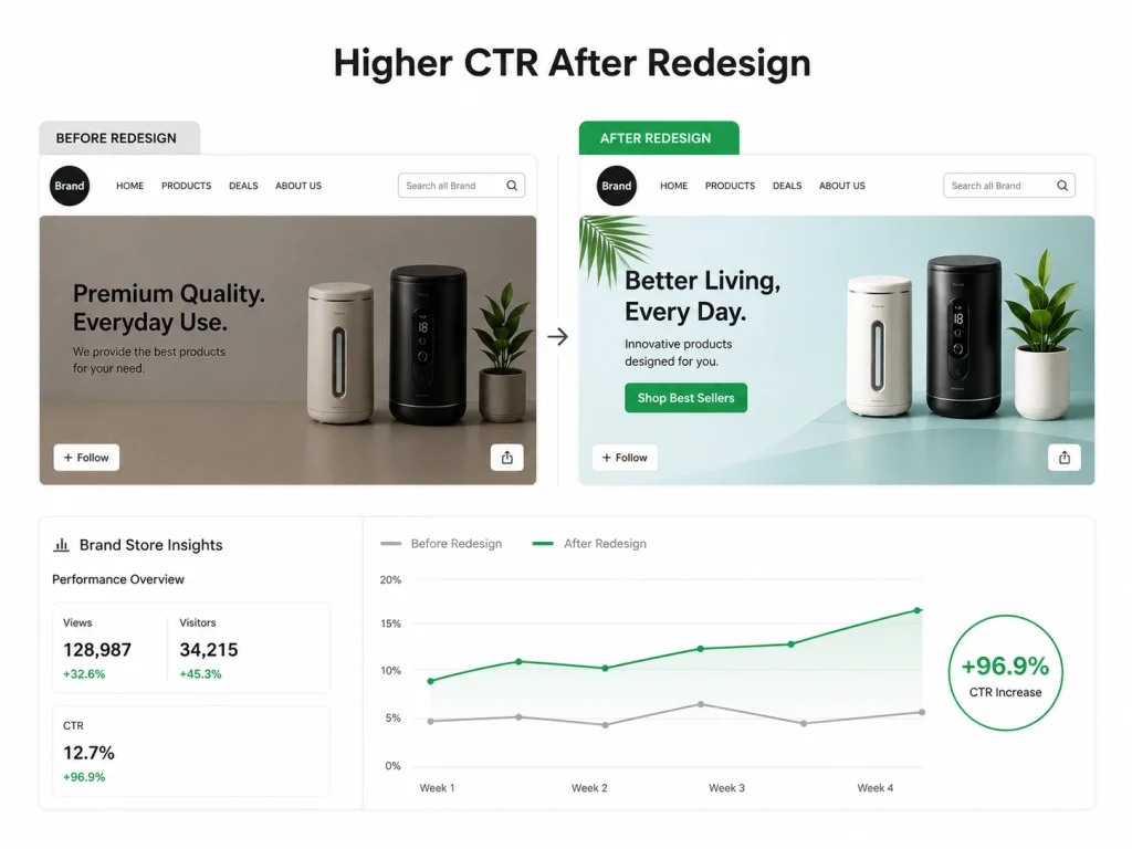
We believe that while a “pretty” banner is subjective, a strategic one is measurable. This took us more than a decade to understand this.
When we audit a store, we don’t just guess; we use Amazon Brand Store Insights to pinpoint exactly where shoppers are dropping off.
Here is how we turned underperforming storefronts into high-conversion assets by fixing the exact mistakes we’ve discussed.
Category 1: Closing the "Trust Gap"
We worked with a Power Solutions brand stuck in “technical spec” mode and a Luxury Skincare brand losing money with a 106.91% ACoS. Both suffered from low authority.
We swapped dry, spec-heavy graphics for high-resolution lifestyle photography that emphasized emotional benefits. For example, “peace of mind” and “premium self-care.” Here is a table that shows the impact on profitability & Ad spend efficiency:
Niche | Key Metric | Before Our Optimization | After 30-Day Audit |
Power Solutions | ACoS | 18.7% | 12.4% |
Power Solutions | ROAS | 5.35 | 8.06 |
Premium Skincare | ACoS | 106.91% | 29.11% |
Premium Skincare | Conv. Rate | 11.2% | 18.4% |
Category 2: Scaling Visibility & Engagement
We identified that a Networking Hardware brand was overwhelming mobile users with tiny text, while a Home Goods brand was invisible in a “sea of gray.” We applied the “5-Word Rule” to simplify messaging and introduced a high-contrast Color Story specifically designed to stop the scroll. Here is a table that shows the impact on reach & engagement velocity:
Niche | Key Metric | Before Our Optimization | After 30-Day Audit |
Tech Hardware | CTR | 0.22% | 0.47% |
Tech Hardware | Sessions | 12,450 | 28,900 |
Home Goods | Total Impressions | 185,653 | 933,052 |
Home Goods | CPC (Cost Per Click) | $1.04 | $0.56 |
The Bottom Line: These weren’t overnight miracles. By fixing mobile cropping issues and weak CTAs, we triggered Amazon’s algorithm. As engagement spiked, Amazon rewarded these brands with massive organic reach and lower costs per click.
When we respect the shopper’s time with clear, professional visuals, the data always follows.
How to Audit Amazon Storefront Banners Like an Expert
Now it is your turn to take action. Go to your Amazon store right now. Open it on your phone and your computer. Does it pass the standards test?
Step 1: The "Squint Test" for Visual Hierarchy
Open your store and squint your eyes until everything is blurry. What is the one thing that still stands out? If it is a busy background or a random tree in a lifestyle shot, you have failed. You should see your product or your primary headline first. That is a clear visual hierarchy.
Step 2: The Mobile-Rendering Cross-Device Check
Borrow an iPhone. Borrow an Android tablet. Check your store on as many screens as possible. If your text looks great on one but is cut off by the “Follow” button on another, you need to adjust your safe zones. Every single shopper deserves a perfect experience.
Step 3: Heatmapping Visual Interest via Store Insights
Amazon provides a wealth of data in your “Store Insights” dashboard. Look at your traffic sources. Look at which pages have the highest bounce rates.
Usually, a high bounce rate is a direct sign of a bad banner. Start your fixes there and work your way through the rest of the store.
Amazon Storefront Banner Requirements You Must Know Before Designing
An Amazon Storefront banner is the large hero image displayed at the top of your brand store. It creates the first impression and helps shoppers understand your brand quickly.
Before designing, check Amazon’s image size requirements for the Storefront banner. Using the wrong dimensions can cause cropping, blurry visuals, or rejected uploads.
Your banner should be clean, high-resolution, and brand-focused. Avoid crowded layouts, tiny text, or too many product images in one frame.
The best Amazon Storefront banners usually include strong product visuals, simple brand messaging, and enough empty space to keep the design readable on desktop and mobile.
Amazon Storefront Banner Safe Zone: What Should Stay Inside the Visible Area
The safe zone is the part of the banner that remains clearly visible across different devices. Important text and product details should stay inside this area.
Amazon may crop banner edges depending on screen size. That means logos, headlines, and key product images should not be placed too close to the edges.
Keep your main message in the center area. This reduces the risk of losing important information on mobile or smaller screens.
A smart safe zone strategy helps your banner look professional everywhere. It also protects your callout, branding, and product focus from accidental cropping.
Amazon Storefront Banner Copy Examples That Convert Better
Good Amazon Storefront banner copy should be short, clear, and benefit-driven. Shoppers should understand the offer or brand promise within seconds.
Example: “Upgrade Your Everyday Kitchen Essentials.” This works because it is simple, category-focused, and tells shoppers what the products improve.
Another example: “Clean Smarter With Tools Made for Busy Homes.” This copy connects the product benefit with a real customer need.
Avoid vague lines like “Best Quality Products.” Instead, use specific value-based copy that highlights comfort, durability, convenience, gifting, or problem-solving benefits.
Frequently Asked Questions (FAQs)
Design on Amazon is about conversions, not looks. Small banner mistakes or policy violations can hurt visibility and sales. Here’s how to fix issues and improve storefront performance quickly.
What is the best size for an Amazon Storefront hero banner?
To maintain “Retina-ready” quality across all devices, we recommend a resolution of 3000 x 600 pixels (a 5:1 aspect ratio). While Amazon allows smaller files, using high-density resolution prevents blurring on 4K and 8K displays, which is critical for maintaining brand trust and professional authority.
Why does my banner look cut off or blurry on the Amazon mobile app?
This usually happens because of “Auto-Scaling.” Amazon’s mobile app often crops the sides of wide desktop banners to fit vertical screens. To fix this, keep your most important visual elements and text within the center 60% of the image (the “Safe Zone”) and ensure your file is uploaded at the highest resolution possible to prevent pixelation during the crop.
Can I use words like "Best Seller" or "Sale" in my banner graphics?
No. Including claims like “Best Seller,” “#1 Rated,” “Free Shipping,” or specific “Discount %” inside your image assets is a direct violation of Amazon’s creative policy. These claims can get your entire Storefront rejected. Instead, use the dedicated Amazon “Deals” tiles and dynamic badges to communicate offers without risking a compliance strike.
How much text should I include on my hero banner?
We recommend the “5-Word Rule.” Shoppers typically decide whether to stay or leave in under three seconds. A cluttered banner with too much copy is overwhelming and often becomes unreadable on mobile devices. Use one punchy, high-impact headline and a clear, benefit-driven Call-to-Action (CTA) to keep the customer journey moving toward a sale.
Will a better banner design actually lower my ACoS?
Yes. While banners don’t change your bid price, they significantly impact your Click-Through Rate (CTR) and Conversion Rate (CVR). As shown in our case studies, professional design reduces the “Trust Gap,” meaning you get more sales from the same amount of ad spend. This increased efficiency naturally drives down your ACoS and improves your total ROAS.
How do I know if my new banner design is actually working?
You should never guess with your brand’s revenue. Use the “Manage Your Experiments” (MYE) tool within the Amazon Brand Registry to A/B test two different banner versions simultaneously. By monitoring your Store Insights dashboard, you can track which design leads to a lower bounce rate and higher units per session, allowing you to optimize based on real shopper behavior.
Ready to turn your failing store into a conversion machine
Shoppers don’t study banners, they scan and decide fast. Your storefront either guides attention or loses it in seconds. Design is not decoration here, it is direction.
Amazon storefront banner design mistakes can quietly hurt performance. Blurry images reduce trust. Too much text creates confusion. Weak visuals fail to explain value. Even strong ads can underperform if the storefront doesn’t match expectations.
Fixing this changes everything. Clear visuals build trust faster. Simple messaging improves understanding. A clean layout naturally leads shoppers toward purchase instead of distracting them.
The goal is clarity. Remove clutter, sharpen your message, and make every banner intentional. Small design fixes can lead to noticeably better conversions over time.


