At first glance, everything looks fine. Traffic is coming in, your storefront appears polished, and products are ready to sell. But results don’t follow. Visitors land, browse briefly, then leave without taking action.
The problem is often subtle but serious. Shoppers expect a smooth, guided experience. Instead, they face cluttered menus, unclear categories, and pages that don’t connect logically. Confusion builds quickly, and exits follow just as fast.
That’s why fixing Amazon storefront navigation issues matters more than most sellers realize. Poor navigation increases bounce rates, wastes ad spend, and hides your best products from potential buyers.
The fix is simple but effective. Use clear categories, keep menus easy to follow, and create a logical page flow. Improve the journey, and shoppers stay longer, explore more, and convert more consistently.
Why Poor Amazon Storefront Navigation Hurts Sales & Ads Performance
Fixing your store layout is not just about making things look pretty. It directly protects your cash. When confusing design meets expensive paid traffic, disaster strikes. We watch this exact scenario play out constantly across hundreds of brand audits.
Consider the real cost of poor navigation. We recently found a live screen recording of a shopper. They clicked on a sponsored ad for a specific night cream. But they landed on a generic homepage. The top menu was broken. They scrolled once, got confused, and instantly left. This directly hurts sales. Your hard-earned ad spend evaporates into thin air. Buying clicks that result in zero revenue is a losing game.
Wasted traffic signals to the algorithm that your brand is irrelevant. Over time, your overall ad performance tanks completely. Running Sponsored Brands campaigns to a messy shop wastes thousands of dollars.
And for many brands, the bleeding is severe. We see poor storefront navigation destroy great products every week. A high storefront bounce rate triggers immediate alarm bells in the Amazon system.
When visitors flee, you run a low-converting storefront. This failure hurts ads performance across your entire catalog. Effective Amazon Ads management demands a frictionless, welcoming landing page.
Data show that poor storefront navigation significantly hurts sales. Brands suffer from sponsored ads low conversion simply because buyers get lost in the digital aisles. Do not let bad menus drain your budget. Sometimes, investing in expert storefront designs for Amazon is the smartest financial move a founder can make.
After more than 11 years of experience, here are the real impact of bounce rate we found:
- High Bounce Rate: Burns ad money. Lowers organic rank. Kills buyer trust.
- Low Bounce Rate: Multiplies conversions. Slashes ad costs. Drives repeat buys.
6 Critical Category Page & Navigation Mistakes That Increase Bounce Rate
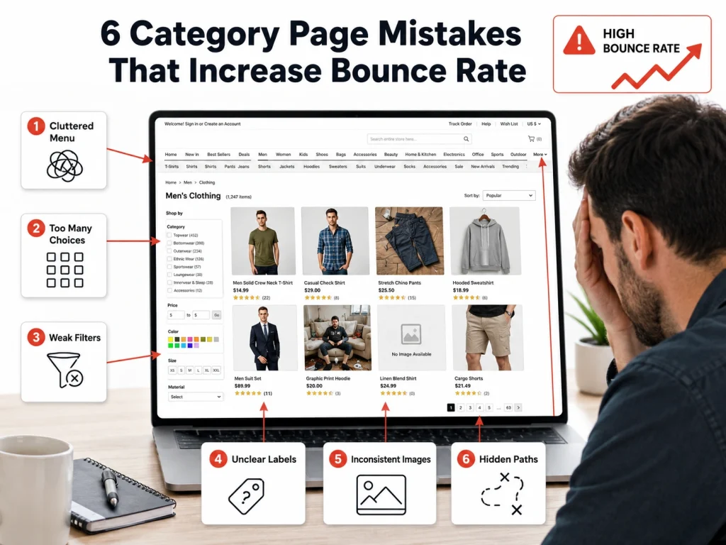
Diagnosing the disease comes before writing the prescription. You must spot the exact roadblocks stopping your buyers. In our agency audits, we at Brand’s Bro, hunt for the specific flaws pushing your traffic away.
Sellers repeat the same critical errors daily. These navigation mistakes force shoppers to close the app. A rising bounce rate almost always starts on a confusing category page. Let us explore the bad structure causing these massive drop-offs. Eliminating these structural bottlenecks changes your profit margins overnight.
Common category navigation mistakes quickly increase bounce rate. When buyers land on a chaotic storefront structure, Amazon tracks their swift exit. A bad storefront structure ruins the buying mood. You absolutely must lower your category page bounce rate. To achieve this, avoid common storefront category navigation mistakes entirely. Let us break down the critical storefront navigation mistakes holding your business back.
Mobile Navigation Problems in Amazon Storefronts
Shoppers buy on their phones. Over 80% of traffic comes from mobile screens. If your shop only works well on a desktop computer, you are losing cash.
Phone screens require giant buttons and clear paths. Yet, mobile navigation often fails completely. Terrible mobile UX drives eager buyers straight to your competitors. When someone opens the mobile app, they expect speed. Instead, they face microscopic text. They poke at unclickable menus.
These mobile navigation problems destroy buyer confidence. Clunky storefront mobile navigation frustrates ready-to-buy shoppers. A confusing mobile storefront UX guarantees instant exits. Launching a bad mobile storefront means throwing mobile ad traffic into the trash. You must correct Amazon storefront mobile navigation right now. Smooth mobile storefront UX Amazon shoppers enjoy leads directly to higher sales. Stop ignoring bad mobile storefront design. Check out some common Mobile UX failures:
- Buttons remain too tiny for a human thumb.
- Text drops below a readable font size.
- Large hero images push product links completely out of view.
Broken Breadcrumbs and Menu Design Flaws
Picture entering a large grocery store with no aisle signs. You look for coffee, walk in circles, and eventually leave without buying anything. This same problem occurs on digital storefronts.
Effective menu design helps buyers find what they need quickly. Poor navigation, on the other hand, causes frustration. Broken breadcrumbs leave visitors stuck deep within a catalog. Without a clear visual hierarchy, it becomes difficult to move through the site. Unclear menu labels add to the confusion.
When expected breadcrumbs are missing, shoppers reach a dead end. Avoid these issues by keeping category paths visible at all times. Straightforward navigation should guide users directly to checkout.
Fixing broken links is essential. Well-structured breadcrumbs and clear navigation keep visitors engaged and increase the likelihood of a purchase. Here is a Bad vs. Good Menu naming comparison:
Bad Menu Name | Good Menu Name |
The Aqua Collection | Hydrating Face Serums |
Daily Essentials | Multivitamins |
Power Max Pro | Heavy Duty Blenders |
Note: This is just an example. Your menu names should reflect your specific products, use clear and descriptive terms, and match the language your customers commonly use when searching.
Weak CTA Placement and Broken Click Paths
Telling shoppers what to do next is one of your main responsibilities. You cannot assume they will naturally find the buy button, so you need to guide their attention clearly.
Poor CTA placement hides important actions and makes it harder for users to complete a purchase. Confusing click paths interrupt the buying process and reduce momentum. Keep your main buttons visible above the fold so they are seen right away. This simple improvement can quickly increase conversions.
Weak CTA placement can also reduce the impact of good product photography. Common mistakes include placing buttons in visually busy areas or using text that blends into the background. These issues make it harder for shoppers to act.
Fix unclear click paths to reduce lost sales. Strong CTA placement improves usability and is favored in marketplace optimization. Remove unclear navigation patterns and make your next step obvious and easy to take.
Disconnected Internal Linking Between Storefront Pages
Shoppers frequently buy multiple items. If a camper buys a heavy-duty flashlight, they usually need batteries. But if your pages do not connect logically, they only buy the flashlight. You leave massive profits on the table.
Strategic internal linking drives much higher order values. Smart cross-selling upgrades the overall buyer journey. Hitting digital dead ends stops the shopping trip entirely. Always connect complementary products. We frequently use custom graphics to build these visual bridges.
For proper internal linking, our Amazon experts use connects related items flawlessly. A smart storefront page linking strategy keeps the buyer clicking. Improve the storefront customer journey by removing isolated pages.
Stop creating missed cross-sell opportunities. Build internal linking Amazon storefront shoppers naturally follow. A solid storefront page linking strategy is non-negotiable. Optimize internal links to improve storefront customer journey metrics. Here’s how to connect complementary pages:
- Place a shoppable image of batteries at the bottom of the flashlight page.
- Build a custom “Frequently Bought Together” product grid.
- Make sure your top menu visually separates, but links related sub-niches.
Overcrowded Sub-Categories and "Choice Overload"
Handing shoppers too many choices can confuse them and slow decision-making. When a menu expands into long lists of links, it becomes harder for users to decide where to go next, which can reduce conversions.
This is known as choice overload and it leads to decision fatigue. Overloading sub-categories with every product variation does not help users.
It makes navigation harder. Large drop-down menus are also difficult to use on mobile devices and can make a brand feel less organized.
To improve navigation, reduce the number of options, and keep the structure simple. Group related products into clear categories instead of listing everything individually. A cleaner menu helps shoppers move through the store more easily and reduces friction.
Focus on simplifying storefront navigation and organizing products in a logical way. This reduces decision fatigue and makes the shopping experience faster and more intuitive.
Menu Pro-Tip: Keep your main navigation to five tabs or fewer, and limit sub-categories to no more than five options per section.
Ignoring Search Intent in Category Naming
Your internal company jargon means absolutely nothing to a buyer. They do not understand your clever marketing names. They only recognize the words they typed into the search bar.
Matching search intent unlocks sales. Clear category naming wins every single time. Drop the internal jargon immediately. Rely on familiar search terms. Simple, obvious tab titles convert the best.
To optimize store navigation, look at the data. Update your brand store navigation based on actual search reports. Use the exact customer search term in your menu bars. Prioritize high-volume search terms. When you optimize Amazon store navigation, you finally speak the buyer’s language. Improve Amazon brand store navigation by actively aligning tabs with search. Here are some jargon vs. search Intent examples:
- Instead of “Canine Nutrition” -> Use “Dog Food”.
- Instead of “Restful Solutions” -> Use “Sleep Gummies”.
- Instead of “Apparel Basics” -> Use “Men’s T-Shirts”.
- Instead of “Sleep Support System” → Use “Sleep Supplements”
- Instead of “Eco Cleaning Solutions” → Use “Cleaning Products”
- Instead of “Performance Footwear” → Use “Running Shoes”
- Instead of “Kitchen Hydration Tools” → Use “Water Filters”
- Instead of “Active Recovery Wear” → Use “Athletic Socks”
Best Amazon Storefront Navigation Structure for Higher Conversions
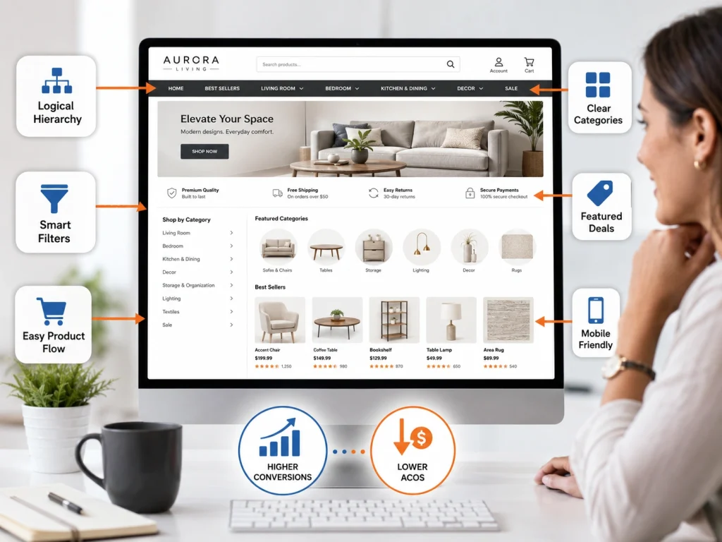
Now you know exactly what breaks a store. It is time to rebuild yours. A clean, organized digital shop floor invites buyers to stay, browse, and spend. Over the years, our team forged a layout framework designed strictly for revenue.
A great storefront structure dictates your success. It guarantees higher conversions. A clean navigation structure acts like a silent salesperson. Building optimal architecture requires planning. But a logical hierarchy pays off instantly.
The best storefront navigation feels entirely invisible to the user. A strong structure for conversions removes every ounce of friction. Follow proven navigation best practices to win your category.
This is exactly how you achieve lower ACOS Amazon sellers dream about. Rely on a storefront structure for conversions. Follow Amazon store navigation best practices strictly. Now, let’s look at our ideal storefront flow:
Home Page >> Broad Main Category >> Specific Product Solution >> Shoppable Product Tile
Implementing the "3-Click" Navigation Rule
Online shoppers expect quick and direct access to products. They are unlikely to browse through multiple layers of a catalog to find what they want. If it takes too long, they will leave.
A useful guideline is the 3-click rule: customers should be able to reach any product within three clicks or fewer. This keeps the shopping experience simple and efficient. Fewer steps between discovery and purchase also helps increase conversions.
To improve the customer journey, map out how users move through your storefront and remove unnecessary steps. Every click should have a clear purpose. Avoid forcing users through long or complicated paths.
Focus on creating a smooth, intuitive navigation flow that leads naturally to checkout. Continuously refine your structure so products are easy to find and the buying process feels effortless.
The 3-Click Journey Broken Down:
- Click 1: The shopper taps the main “Skincare” menu tab.
- Click 2: The shopper taps the specific “Night Creams” image tile.
- Click 3: The shopper taps the “Add to Cart” button on the widget.
Utilizing Product-Based vs. Solution-Based Categorization
How you group inventory depends on what you sell. Some brands sell physical products, while others sell solutions to specific problems. Your category structure should reflect how your customers naturally think and shop.
Use product-based categorization for straightforward items like clothing or electronics, such as laptops, keyboards, and monitors. Use solution-based categorization when customers are shopping for a result or need, such as anti-aging, acne control, or dry skin.
The main goal is to match your navigation to buyer intent. When your structure aligns with how people search and decide, products are easier to find, and the entire shopping experience becomes faster and more intuitive.
We fix Amazon Storefront Navigation Issues by improving category structure, menu flow, and customer browsing paths.
Our service helps your Amazon Storefront look cleaner, easier to shop, and more professional for better engagement.
How to Audit Amazon Storefront Navigation Like an Expert
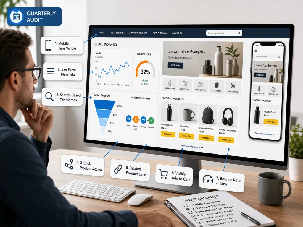
You cannot fix what you do not measure. Guesswork leads to poor decisions. Data shows exactly where visitors drop off and where your store is losing sales.
A proper storefront audit means reviewing your Store Insights dashboard and identifying friction points in the customer journey. Focus on where traffic declines and where users stop engaging.
Audit your storefront regularly, ideally every quarter. This helps you catch hidden issues in navigation and layout before they impact revenue. Here is our storefront audit checklist:
- Are mobile tabs fully visible without sideways scrolling?
- Do you have five or fewer main navigation tabs?
- Are tab names based on real customer search terms?
- Can users reach any product within three clicks?
- Do sub-pages link to related products?
- Are “Add to Cart” buttons visible without scrolling?
- Is your bounce rate below 40%?
Amazon Storefront Navigation Case Study: Lower Bounce Rate After Optimization
At Brand’s Bro, we use data to improve storefront navigation and increase conversions. In the Beauty & Skincare case, we replaced jargon with clear search terms like “Dry Skin” and “Anti-Aging.”
This improved performance, with ACoS dropping from 106.91% to 29.11% and CVR rising significantly from 11.94% to 18.72%.
These results consistently show one thing: better navigation directly increases conversions and revenue. To see our full case studies and learn more, click here.
Frequently Asked Questions (FAQs)
Feeling stuck is normal when improving your storefront. Here are simple answers to common questions to help you start optimizing your store with confidence today.
Approval usually takes around 24 hours, but in some cases it can extend up to 3 days if Amazon triggers a manual review. To avoid delays, keep your content clean, use simple category names, and avoid promotional phrases like “best” or “#1 product” in your navigation.
Yes, Amazon allows Store Versions for testing different layouts. You can compare product-based and solution-based navigation styles. Run each version for at least four weeks and evaluate performance using bounce rate, conversion rate, and sales per visitor to make a data-driven decision.
Desktop layouts are more forgiving, but mobile is strict. Too many images or complex structures can turn into tiny, hard-to-click elements. Always preview on mobile before publishing and prioritize thumb-friendly navigation with simple, clean layouts designed specifically for smaller screens.
No, it will not hurt rankings. In most cases, it improves them. Better navigation increases conversions and sales velocity, which are key ranking signals for Amazon. A clearer structure helps more shoppers find products faster, leading to stronger organic performance over time.
Yes, always hide them. Showing unavailable products creates frustration and increases bounce rates. Customers may assume your store is unreliable. Keeping only in-stock items visible ensures a smoother shopping experience and maintains trust in your storefront.
Too many sub-pages create friction and slow down navigation. If shoppers need more than a few clicks to find a product, you risk losing them. Keep your structure simple, shallow, and easy to navigate so users can reach products quickly and efficiently.
Your Next Steps for Storefront Growth
If shoppers feel lost, they leave. Confusing structure and unclear paths push potential buyers away before they even see your products.
This becomes a direct storefront navigation issue and leads to lost conversions. When customers can’t find what they need quickly, they simply exit and buy elsewhere.
Focus on clean categories, simple flow, and reduced clutter. Small navigation improvements can significantly increase engagement and sales.
Treat navigation as a priority, not an afterthought. Regularly review your storefront, remove friction points, and improve product organization when needed.


