A webpage gets judged in under a second. Most visitors decide to stay or leave before they finish one line. That snap judgment can quietly sink a sale before it even begins.
We have spent years helping brands across the USA solve that exact problem. Our team has designed and rebuilt hundreds of webpages for online stores, service businesses, and growing startups.
We worked with clients in the USA, and most of them arrived with the same complaint. Their pages looked fine, yet almost nobody was buying.
One of our clients ran a clothing brand with strong products and flat pages. Our designers rebuilt their main product page and reworked the layout around how shoppers actually scan. Within three months, their conversion rate jumped by 12%, and monthly revenue nearly doubled.
Another client sold home appliances and battled a bounce rate above 70%. We redesigned their landing page, stripped out the clutter, and gave every trust signal room to breathe. Their bounce rate dropped by more than 40% in a single quarter, while ad spend fell at the same time.
We have worked beside developers, founders, and marketing teams to turn slow pages into reliable sellers. That hands-on work taught us what truly moves the needle and what only looks impressive. So this guide on how to design a webpage comes from years of client results, not recycled theory.
You will get a clear, no-jargon process that fits beginners and busy business owners alike. We will walk you through every step our designers use, from the first goal to the final test. By the end, you will understand how to design a webpage that looks sharp and turns visitors into customers.
What Is a Webpage?
A webpage is a single document that lives online at one web address. People open it inside a browser like Chrome or Safari. The page holds text and images, plus links, video, and several topics at once.
Webpages come in two main types. A static webpage shows the same fixed content to every visitor. Dynamic webpages change their content based on the user or live data.
A blog post often works as a static webpage. Your account dashboard runs as a dynamic webpage instead.
Static pages load fast and cost less to host. Dynamic pages cost more, though they handle large and changing content with ease. That foundation leads us into the meaning of design itself.
What Does Webpage Design Mean?
Webpage design means planning how one page looks, reads, and works for a visitor. It blends structure, copy, visuals, usability, and technical performance into one clear experience. The aim stays simple: guide one person toward one action.
Design is not decoration. A page must work before it looks good. Function leads the build, and the visuals follow.
Strong webpage design answers three simple questions in a flash. Where am I? What can I do here, and why should I care?
A webpage that answers those fast keeps visitors moving toward the goal. Confusion is the enemy of every sale. Learning how to create a webpage starts with that clear mindset.
This skill sits inside the larger website design process. Each choice serves the visitor and the business goal. People often mix this work up with a different job.
Webpage Design vs. Webpage Development
Webpage design and webpage development are two different jobs that build one page together. Design covers the look, layout, and feel of the page. Development covers the code that makes everything function.
The roles are split in a clean way. The table below shows the difference at a glance. A quick comparison helps you hire the right person.
Area | Webpage design | Webpage development |
Main focus | Look, layout, user experience | Code and function |
Core skills | Color, type, visual hierarchy | HTML, CSS, scripts |
Tools used | Figma, Adobe XD | Code editors, frameworks |
Output | The plan and the visuals | The working page |
A designer maps the headline, colors, and button spots. A developer turns that map into a live page. One strong page needs both skills in sync. That balance leads us straight into why design matters so much.
Summary: Web development turns a static webpage into a dynamic page using a different programming language. For example, PHP, Python, and more.
Why Good Webpage Design Matters
Good webpage design matters because it shapes trust, sales, and search rankings at the same time. A clean page earns attention fast. A messy page loses that attention in seconds.
First impressions form in about 50 milliseconds. That speed alone decides if a visitor stays or bounces. Sharp design lowers your bounce rate and keeps people reading down the page.
Design also drives your conversion rate and your lead flow. Clear pages turn more visitors into leads and sales. Weak pages waste the traffic you paid hard money for.
Search visibility climbs when pages load fast and feel useful. SEO web design pairs quick pages with helpful, on-topic content. So strong design supports both people and rankings together.
Brand perception grows with every single visit. Smart design also lifts the website user experience for each person. A broken page signals risk and pushes buyers away. Before any design begins, the right tools set you up to win.
Tools and Platforms You Need to Design a Webpage
You need a few core tools to design a webpage that performs. Some help you plan the layout. Others help you build and launch the live page.
Design Tools
Design tools help you sketch, plan, and shape a webpage before launch. They let you test layouts without touching code. A clear mockup saves hours of rework later.
Figma leads the pack for layout, mockups, and team feedback. It runs in the browser, so sharing a draft takes one link. Many designers map the full page inside it before a single pixel goes live.
Adobe XD works in a similar way for screen design and prototypes. The choice between the two often comes down to taste and team habit.
A loose sketch on paper costs nothing and frees your ideas. You then move that idea into Figma or Adobe XD for polish. The tool matters less than a clear plan behind it.
Platforms Where the Page Gets Built
A content management system, or CMS, is software that helps you build and manage pages without heavy code. It stores your content and handles the technical side for you. Most modern webpages live on one of these platforms.
The right platform depends on your goal, budget, and skill level. A quick table lays out the main options side by side. The sections after it break each one down further.
Platform | Ideal for | Ease of use | Typical cost |
WordPress | Blogs, flexible sites | Medium | Low to medium |
Shopify | Online stores | Easy | Monthly fee |
Wix | Beginners | Very easy | Low |
Squarespace | Clean, visual brands | Easy | Low to medium |
Webflow | Custom design control | Medium to hard | Medium |
Each platform fits a different kind of project and owner. The choice you make here shapes the whole build.
WordPress
WordPress powers a huge share of the entire web. It started as a blog tool and grew into a full website builder. Owners love it for its flexibility and the massive library of plugins.
Plugins add features without code, from contact forms to SEO tools. Page builders like Elementor let you design with drag-and-drop blocks. So even a beginner can shape a clean layout over time.
The trade-off is upkeep and a small learning curve. You manage hosting, updates, and security on your own. For content-heavy brands, that control is well worth the effort.
Here’s how a page comes together in WordPress: Pick a theme → Add a page builder → Drag in blocks → Edit text and images → Preview the page → Publish. Each arrow moves you one step closer to launch.
Shopify
Shopify is the top platform for online stores and product pages. It handles products, carts, and checkout out of the box. Store owners pick it because selling feels smooth from the first day.
The platform bundles hosting, security, and payments in one place. Themes give you a fast start, and apps add extra power. A growing store can scale on it without a full rebuild.
Speed and a clean buyer path drive most store sales. Pages built for checkout often rely on careful Shopify development to keep buyers moving. A smooth flow turns more browsers into paying customers.
Here’s how a page comes together in Shopify: Choose a theme → Add your products → Customize the sections → Set up checkout → Preview → Launch. Each step shapes the page around the sale.
Wix
Wix is the friendliest platform for total beginners. Its drag-and-drop editor lets you place anything anywhere. You see the live design as you build it.
The plan bundles hosting, templates, and basic SEO in one package. Hundreds of free templates give you a quick head start. A small business can launch a page in a single afternoon.
The limits show up as your needs grow. Switching templates later can get tricky. For a simple brochure page, though, Wix gets the job done.
Here’s how a page comes together in Wix: Pick a template → Drag elements onto the page → Edit text and images → Adjust the mobile view → Publish. Each arrow keeps the build fast and clear.
Squarespace
Squarespace suits brands that want clean, visual pages with little effort. Its award-style templates look sharp right out of the box. Creatives and product brands gravitate toward its polished feel.
The all-in-one plan covers hosting, design, and basic store tools. Built-in galleries make images shine on the page. Photographers and boutiques often favor it for that reason.
The platform trades some flexibility for that clean look. Deep custom changes feel harder than on WordPress. For a design-led brand, the simple control is a fair swap.
Here’s how a page comes together in Squarespace: Select a template → Add content blocks → Style with the editor → Connect a domain → Publish. Each step keeps the design tidy and balanced.
Webflow
Webflow gives designers strong control without writing much code. It blends a visual editor with the power of custom design. The output stays clean and fast for users.
The tool sits between a simple builder and full development. You shape layouts with precise control over every element. That power comes with a steeper learning curve than Wix.
Agencies and serious designers reach for it on custom projects. It suits brands that want a one-of-a-kind page. Many people skip all of this and start from a ready-made template instead.
Here’s how a page comes together in Webflow: Start a project → Build the layout → Style each element → Add interactions → Publish. Each arrow turns your design into a live page.
How to Design a Webpage Template
A webpage template is a reusable layout you build once and fill many times. Learning how to design a webpage template means creating that structure yourself, not editing a finished one. The goal is a flexible skeleton that holds any content you drop in later.
Here is the process to design a template from the ground up. These steps move from structure to a working design system. Each one builds the layout that others will fill.
- Map the page goal and the content blocks it must hold.
- Sketch a wireframe of the layout before any styling.
- Build a grid and spacing system for consistent alignment.
- Define reusable sections like the header, hero, and footer.
- Set design tokens for colors, fonts, and button styles.
- Create placeholder slots where real content will go later.
- Test the layout with long and short content to confirm it flexes.
That process gives you a layout anyone can reuse without breaking it. A strong template holds up no matter what content fills it.
How to Design a Webpage in HTML
You design a webpage in HTML by writing simple tags inside a text editor. HTML stands for HyperText Markup Language. It forms the basic structure behind every webpage.
Learning how to design a webpage in HTML needs only two things. A free text editor like Notepad covers the writing side. Any browser, such as Chrome, shows you the result.
Here is the process to build a page in HTML, in clear order. These steps move from a blank file to a live page. Each tag adds one piece.
- Open a text editor like Notepad.
- Add the HTML, head, and body tags.
- Place a heading and a paragraph in the body.
- Insert an image tag and a link tag.
- Save the file with a .html ending.
- Open the saved file in your browser.
Those six steps build a basic page by hand. This shows how to design a webpage using HTML from scratch. Raw HTML hands you full control, while a builder trades it for speed.
The Step-by-Step Webpage Design Process
Good webpage design begins with smart decisions before the visuals appear. The steps below show how to create a page that feels clear, useful, and easy to act on.
Step 1: Set One Clear Goal for the Webpage
First and foremost, you have to set your goals and determine which types of webpages you need. For example, choose if you need a service page, a landing page, a webpage, or something else.
Every webpage needs one clear purpose to succeed. A single goal keeps the page focused and easy to act on. Pages chasing many goals confuse people and convert very few.
Common page goals stay simple at heart. A page can inform, sell, generate leads, book calls, or build trust. One of these should lead the whole design.
The goal shapes your entire layout and content. A sales page pushes hard toward the buy button. A trust page leans on proof, stories, and a calm tone.
Unclear goals create weak, leaky pages. The visitor cannot tell what step to take next. A sharp goal removes that doubt and guides the eye. Your goal then needs a clear audience to speak to.
Step 2: Understand Your Target Audience
Your target audience is the group of people the page serves. You design for their needs, not your own taste. Their wants drive every smart decision on the page.
A few questions matter more than the rest. What does the visitor already know about your offer? What problem do they want solved today?
The audience also shifts with the kind of page you build. A homepage greets a mixed crowd, while a service page meets someone deciding whether to hire you. A product page serves a shopper comparing details, and a blog page draws a reader chasing an answer.
Objections deserve equal weight in your plan. People hesitate before they buy, subscribe, or book a call. A good page answers those doubts before they grow into a no.
The tone and layout also shift across each page. A homepage leans on a clear promise, while a service page wins with proof and a calm pitch. A product page sways a shopper with images and bold buttons, and a blog page holds a reader with depth.
Once you know the audience, you can match their search intent.
Step 3: Match the Webpage to Search Intent
Search intent is the reason behind a person’s search. Matching it means giving people exactly what they hoped to find. A mismatch sends them straight back to Google.
Four main types of intent shape every query:
- Informational intent wants answers or how-to help.
- Commercial intent compares options before a purchase.
- Transactional intent is ready to buy or act now.
- Navigational intent looks for a specific brand or page.
Intent decides your page structure and tone. A buying page needs prices and a strong button up front. A learning page needs depth, steps, and clear examples.
You can read intent without guessing. The pages already ranking show what Google rewards for that term. That insight leads us into smart competitor research.
Step 4: Research Competitor Webpages Before You Design
Competitor research means studying the pages that already rank for your topic. The top results reveal what users and Google reward. You learn the bar before you try to clear it.
A few elements deserve a close read. Content depth shows how much ground a page covers. Headings and layout reveal the structure that already works.
Their calls to action carry hidden lessons, too. Their button spots and button words show proven patterns. Gaps in their content point to your biggest opening.
Missing information is your sharpest edge. A question they skipped becomes one you answer better. Strong research then turns into a strong plan.
When you research competitors for a webpage, it is mandatory to check out the following checklist.
- Webpage color, font, space, speed, etc.
- If the webpage is built with WordPress, you can check out the competitor theme.
- For e-commerce pages, it is essential to look at product images, view cart, add to cart, and other sections.
Step 5: Build a Simple Webpage Strategy Before You Open a Design Tool
A webpage strategy is a short plan that guides your whole design. It saves you from random changes and wasted hours. A clear map beats jumping into a tool with no direction.
Your one-page brief should lock down the basics first. A simple table keeps every choice in view. The brief takes minutes to fill, yet it steers the entire build.
Brief Item | What to Define |
Page goal | The one action you want |
Audience | Who the page serves |
Primary keyword | The main search term |
Main CTA | The button people click |
Content sections | The blocks in order |
Proof elements | Reviews, logos, results |
Visual needs | Images, icons, video |
SEO needs | Title, meta, headings |
This brief becomes your reference for every design call. It also locks in the platform you picked earlier. With the plan in hand, the structure starts to take shape.
Step 6: Plan the Webpage Structure
Webpage structure is the order and nesting of sections on your page. A clear structure maps your layout onto clean HTML blocks. Each region gets a clear job and a clear place.
A standard page splits into a header, a main area, and a footer. The header holds the logo, the navigation menu, and a call to action. The footer closes the page with links, contact details, social icons, and legal notes.
The main area stacks the core sections in a logical order. It opens with a hero, a trust bar, and a features or benefits block. An about section, a how-it-works block, testimonials, pricing, an FAQ, and a final call to action follow.
Good structure nests each part from broad to specific. A section holds headings, and headings sit above the text and images they own. The next move sketches all of this as a wireframe.
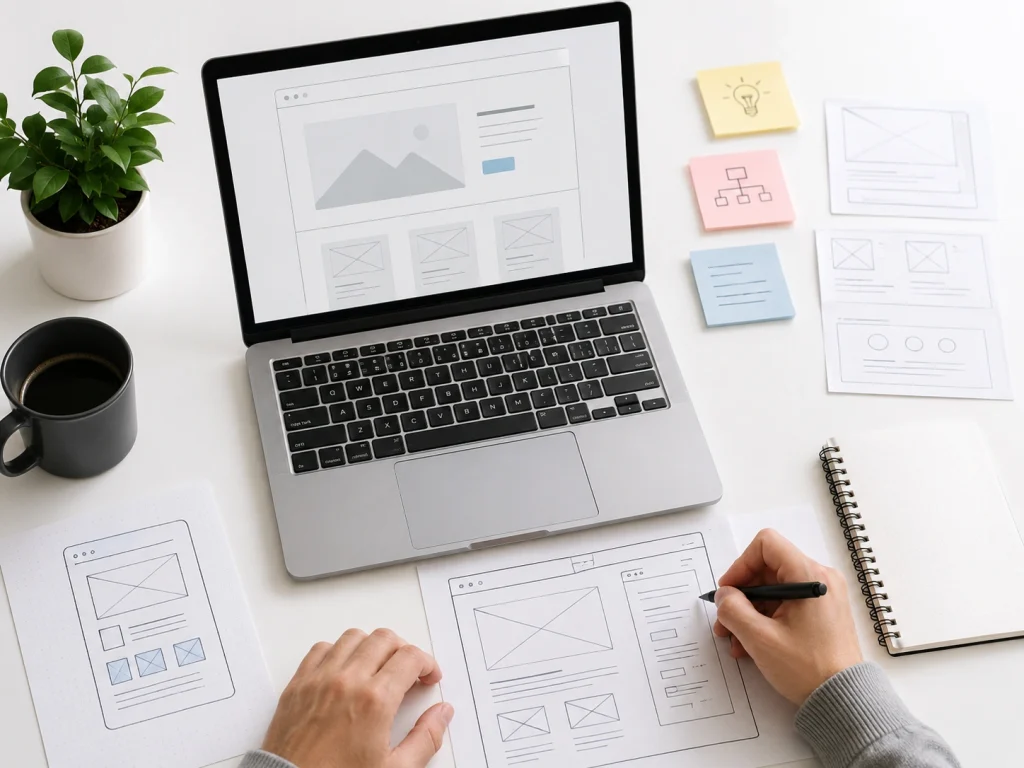
Wireframe the Page First
A website wireframe is a rough blueprint of your page layout. It maps where each block sits, with no colors or final art. The point is structure, not styling.
Wireframes save serious time on a build. They catch layout problems before any design work begins. A small sketch prevents a costly redo later.
You can keep a wireframe low-fidelity or high-fidelity. A low-fidelity wireframe uses plain boxes and labels. A high-fidelity version adds spacing, sizing, and finer detail.
Common tools handle this stage with ease. Figma and Adobe XD shine for digital wireframes. Paper still works for a fast first pass on the couch.
Step 7: Use CSS and JavaScript to Design HTML Structure
CSS and JavaScript turn your bare HTML structure into a styled, working page. HTML lays the bones, CSS adds the look, and JavaScript adds the action. The three work as one to bring a template to life.
CSS controls how every element looks and sits on the page. It sets the colors, the fonts, the spacing, and the layout. Tools like Flexbox and Grid line up your sections with little effort.
A framework like Bootstrap speeds up this work even more. Bootstrap ships with a ready grid, buttons, and responsive classes you apply in the HTML. Custom CSS then refines whatever Bootstrap leaves plain.
JavaScript adds the movement that a static page lacks. It powers menus, sliders, and pop-ups, and it checks forms on submit. With the styling and the action in place, the next move tests the template.
Step 8: Design the Key Sections of the Webpage
Now the real building work begins on each part of the page. Every webpage is split into a few key sections with clear jobs. Each one needs a single focus and a clean design.
The Header and Navigation
The header is the strip at the very top of the page. It holds the logo and the menu beside a clear button. This bar helps visitors find their way at a glance.
A short menu of clear links beats a long, crowded one. The most important page sits first in the row. A sticky header keeps the menu in reach as users scroll.
The Hero Section
The hero section is the top area people see first. It pairs a headline and a subheading with one main button. This space decides if a visitor keeps scrolling.
A clear headline states one strong benefit in plain words. It speaks to the visitor, not about your company. Short and direct beats clever and vague every time.
The strongest hero image shows a product or a result. Clutter drains the power of this space. An open layout and one clear focus win the scroll.
The Main Content Sections
The main content area holds the body of the page. It stacks sections like features, benefits, and social proof. Each section wraps one idea and one clear heading.
A features block explains what you offer in plain terms. A testimonial row adds trust through real customer voices. An FAQ block clears the last doubts before the action.
The Sidebar
The sidebar is a narrow column beside the main content. It holds extra links and recent posts, or a search box. This column suits blogs and other content-heavy pages best.
A sidebar works best when it stays light and useful. Too many widgets pull focus from the main content. A landing page often drops the sidebar for a tight focus.
The Footer
The footer is the strip at the very bottom of the page. It closes the page with links, contact details, and social icons. Visitors look here for quick info and legal notes.
A clear footer groups its links into tidy columns. A small map or a sign-up box can sit here, too. The footer also carries the copyright and policy links.
Visual Hierarchy Across Sections
Visual hierarchy guides the eye toward what matters most. Size, contrast, and spacing all build this order well. The biggest element should be the most important one.
A few habits create a strong visual hierarchy with ease. Larger headings pull attention first, and high contrast makes a button pop. One or two emphasis points keep the focus sharp.
The Right Layout for the Page
The right layout fits your content and your goal. A good webpage design layout serves the message, not the trend. Each layout option below works for a clear purpose.
- A single-column layout stacks content in one vertical line for phones
- A two-column layout places text beside an image or sidebar
- A grid layout arranges blocks in even rows and columns
- A card-based layout packs each item into its own boxed card
- A Z-pattern layout guides the eye in a Z across the page
- An F-pattern layout follows how people scan text-heavy pages
A long-form layout suits one big offer and a single goal. A product page needs images and reviews, besides a clear price. The next step puts these sections to the test.
Step 9: Write the Copy Before the Pretty Visuals
Copy is the words on your page. It should come before the visuals, not after them. The message shapes the design, so the words lead.
Your headline guides the whole layout. A strong line tells you which image fits beside it. Weak copy leaves the design with no anchor.
CTA text changes your results in a big way. “Get my free quote” beats a dull “Submit” button. Specific words lift the conversion rate on the page.
Many builders drop in dummy text during the first draft. That filler, often called lorem ipsum, hides real flaws in the flow. Final copy shows what the page truly needs to convert.
Turn Features Into Benefits
A feature is what a product has. A benefit is what the user gains from it. People care about the outcome, not the spec sheet.
The switch is simple once you see it. A long-life battery is a feature. “Work all day without a recharge” is the benefit.
Benefit-driven copy makes a page clear and persuasive. Each bullet ties a feature to a real win. That focus pushes more visitors to take action.
Design Strong Calls to Action
A call to action, or CTA, is the button that tells people what to do next. It should stand out and feel easy to click. The whole page points toward this one moment.
A primary CTA carries the main goal of the page. A secondary CTA offers a softer step, like “Learn more.” Both earn a place when used with care.
CTA placement spreads across the page. One sits in the hero, and others repeat as people scroll. A long page keeps the button within reach at all times.
Step 10: Add Trust Signals and Social Proof
Trust signals are elements that prove your business is real and reliable. They lower fear and lift sales. People buy from brands they believe in.
Several proof types work well side by side. The list below covers the ones we lean on most. Each adds a layer of confidence for the visitor.
- Testimonials and reviews from happy customers.
- Case studies that show clear, named results.
- Client logos and recognizable brand mentions.
- Certifications, awards, and security badges.
- Money-back guarantees and visible contact details.
Genuine photos beat stock images for trust. An author bio adds a human face to your advice. Together, these social proof elements make a page feel safe. Trust also grows from how the page reads and looks.
Give the Webpage Room to Breathe With White Space
White space is the empty area around your content. It gives elements room and makes a page easy to use. Crowded pages feel stressful and hard to read.
Spacing improves focus in a direct way. Padding and margins separate blocks into clean groups. Each section then reads on its own.
Clear gaps mark where one section ends and the next starts. A button with space around it feels far more clickable. White space is a design tool, not wasted room.
Brands often fear empty space and fill every gap. That instinct backfires and buries the message. Generous spacing signals calm, focus, and quality.
Use Images, Icons, and Favicons the Right Way
Images and icons should add meaning, not noise. Every visual needs a clear purpose on the page. Random graphics slow the page and split attention.
Strong images show product, service, result, or emotion. Generic stock photos weaken trust fast. Genuine photos of your work feel honest and warm.
Smart image habits keep pages fast and friendly:
- Compressed files that load in less time.
- Descriptive alt text for SEO and screen readers.
- A consistent style across every visual.
- Short labels paired with each icon.
An icon is a small symbol on the page that explains an idea. A favicon is the tiny image in the browser tab, and it is a different thing. A simple, square, on-brand favicon looks sharp at a small size and lifts brand recall.
Make the Webpage Work on Every Screen With Responsive Design
Responsive webpage design means the page adjusts to fit any screen size. It looks good on desktop, laptop, tablet, and mobile. Over half of all web traffic now comes from phones.
A few methods make this happen. Flexible grids let content stretch and shrink with the screen. Responsive images scale without breaking the layout.
Breakpoints set where the layout shifts for smaller screens. Landscape mode needs a quick look, too. A mobile-friendly webpage loads well and reads well on every phone.
Mobile-first webpage design treats the phone as the main screen. You design the small view first, then scale up. That order keeps the most important content front and center. A responsive page still needs easy navigation to work.
Speed Up Your Webpage
Webpage speed is how fast your page loads for visitors. A fast page keeps people happy and ranks better. The steps below cut your load time in real terms.
Clean structure is the first step that most people skip. Lean, well-nested HTML gives the browser less code to read and render. A flat structure with fewer wrapper tags paints the page faster.
Heavy images are the next big cause of slow loads. Compressing each image and saving it as WebP shrinks the file fast. A lazy-load setting holds off-screen images until a user scrolls to them.
Code and server moves finish the job. Minified CSS and JavaScript cut the file size, and browser caching speeds return visits. A content delivery network and solid hosting then handle every request. A quick load-time test reveals your true numbers.
Make the Webpage Accessible to Everyone
Accessibility means people with disabilities can use your page with ease. The fixes below open the page to every visitor. They also feed your SEO at the same time.
Semantic HTML carries most of the weight here. Proper heading tags and landmark regions help screen readers map the page. This same clean structure helps search engines read the page, too.
A few content habits round out the work. Alt text describes each image for screen readers and image search. Clear form labels, descriptive link text, and ARIA tags remove guesswork for the user.
Readable contrast and keyboard access come next. Text should stand out from its background for low-vision readers. Color alone should never carry meaning, so a label or icon backs it up.
Webpage Examples by Page Type
Different pages need different designs to win. Each page type serves a unique goal. The sections below break down the five most common types.
Homepage
A homepage acts as your brand and navigation hub. Homepage design greets first-time visitors and points them to where to go. The page must answer who you are and what you offer in seconds.
A strong homepage opens with a clear brand statement. It then shows core services, trust signals, and a main CTA. Short sections on “who you help” and “why choose you” build fast confidence.
Service Page
A service page sells one offer through a clear story. It moves from the problem to the solution to the proof. The page ends with a strong call to action.
The best service pages cover a few key blocks. They name the problems solved and the benefits gained. A simple process, service areas, and a proof seal the trust.
Product Page
A product page gives shoppers everything they need to buy. It shows the product details, images, price, and reviews. Each part answers a question a buyer would ask.
Clear photos from many angles build buyer confidence. Honest reviews handle doubt better than any sales pitch. A bold add-to-cart button keeps the path to purchase short.
Blog Page
A blog page educates readers and grows your search traffic. It answers questions your audience types into Google. Helpful posts pull in new visitors over time.
Strong blog pages use clear headings and short paragraphs. Internal links guide readers to your service and product pages. That structure supports both learning and SEO.
Landing Page
A landing page focuses on one audience, one offer, and one goal. Landing page design strips away the menu to hold attention. Every block pushes toward a single action.
A high-converting landing page opens with a strong hero section. It then stacks benefits, proof, and objection handling in order. A short FAQ and a tracking setup round out the page.
How Much Does It Cost to Design a Webpage?
The cost depends on your platform. Each builder charges a monthly fee, and the range is wide. So how much does a webpage cost to be designed on these platforms?
The table below shows typical 2026 plans for the five main platforms. These figures cover entry plans in the USA. Most platforms bill once a year for a small discount.
Platform | Typical monthly cost | What you get |
WordPress | $5 to $15 hosting | Free software, paid hosting, and themes |
Wix | $17 to $36 | Hosting, templates, support in one plan |
Squarespace | $16 to $49 | Clean templates and built-in tools |
Webflow | $14 to $39 | Design control plus hosting |
Shopify | $39 and up | Full store and checkout tools |
A domain adds about $10 to $20 a year on top. Premium themes or apps can raise the total further. The right platform balances your budget against your goal.
Many brands quote far higher numbers for custom work. Our pricing stays fair, and our pages stay built to convert. You get agency-grade work without the bloated invoice.
How to Become a Webpage Designer
The path to become a webpage designer starts with a handful of core skills. You need design basics, some HTML and CSS, and a sharp eye for layout. A little copy and SEO knowledge sets you apart from the crowd.
A few skills carry most of the daily job:
- Design fundamentals like layout, color, and type.
- Basic HTML and CSS for structure and style.
- UX thinking that keeps pages simple.
- Copywriting that makes pages persuasive.
- SEO basics that help pages rank.
Tool skills matter just as much as theory. Figma, WordPress, and a builder or two cover most client work. Practice on sample layouts builds real speed and confidence.
A portfolio proves your skill to future clients. Three to five sample pages show your range and taste. Niche work, like store pages, attracts higher-paying clients.
First clients come from a few reliable places. Freelance sites, referrals, and local businesses all open doors. Steady learning keeps your skills current as trends shift. Skilled or new, a few mistakes still trip most people up.
Pricing your own work is its own skill. New designers often ask how much to charge for a sales page w
Common Webpage Design Mistakes to Avoid
The worst page errors happen before any design starts. They come from skipped planning, not bad colors. A quick look at your process catches them early.
These mistakes show up across many client projects. Each one weakens results at the root. The list points to the planning gaps worth fixing first.
- Designing the page before you set a clear goal.
- Skipping audience and search intent research.
- Copying a competitor with no real plan.
- Choosing the wrong platform for your needs.
- Launching with no testing or tracking in place.
- Treating mobile as an afterthought.
Each gap above costs you leads over time. A short planning step fixes most of them. Clean planning then leads straight into clean execution.
Dos and Don'ts: Quick Best-Practice Checklist
This website design checklist covers on-page execution, not planning. It gives you a fast visual review before launch. These webpage design best practices keep the page sharp.
The two lists below focus on what users see. You will get an idea about what to do and what not to do.
Do:
- Benefit-led copy near the top.
- A CTA with bold color and space.
- Genuine proof close to the offer.
- Two fonts and clean spacing.
- Compressed images for a fast load.
Don’t:
- A cluttered hero section.
- The main button hidden below the fold.
- Generic stock photos across the page.
- Body text shrunk past easy reading.
- More than three core colors.
This checklist keeps your visuals honest and clear. It pairs with the planning fixes above. A page that passes both tends to win.
Frequently Asked Questions
People ask our team common questions about page design every week. The short answers below reflect what we see in client work.
What is the difference between a webpage and a website?
A webpage is one single page at one web address. A website is the full group of pages joined together.
How much does it cost to design a webpage?
A page can cost nothing on a free builder. A custom freelancer or agency page runs from $500 to $10,000 or more.
How can I design a webpage for free?
Free builders like Wix and WordPress.com let you launch at zero cost. You trade away some features and accept a few limits.
How do I design a webpage in HTML?
You write simple tags in a text editor and save the file as .html. The browser then opens that file as a working page.
Should I use a template or build from scratch?
A template is faster and cheaper for most simple pages. A custom build fits complex needs and a one-of-a-kind look.
Do I need to code to design a webpage?
No, modern builders handle the code for you. Coding helps with control, though it is not required to start.
How do I become a webpage designer?
You learn design basics, some HTML and CSS, and a tool like Figma. A small portfolio and your first clients grow your career from there.
Build a Webpage That Wins Customers
Strong pages are never luck. They follow a clear path from goal to launch. Now you know how to design a webpage that earns trust and drives sales.
The nine steps stack into one simple system. You set a goal, study the audience, plan the structure, and design with intent. Copy, proof, speed, and testing, then turn that plan into results.
Our team has used this exact webpage design process to grow brands across the USA and beyond. Real pages, real revenue, steady growth. If you want a page built to convert, we are ready to help.