You know that feeling when you’re this close to buying something online and then the site asks you to create an account, type your address twice, and confirm your password like it’s a secret mission? Yeah, that’s the moment most people bail.
Your checkout should feel like a friendly high-five, not a tax form. The faster and smoother it is, the more money your store makes – simple math. Every click, every field, every second either pulls customers in or pushes them out.
The good news? Magento gives you the tools to make checkout so easy it feels invisible. Let’s break down how to turn that final step into your highest-converting moment.
Why Checkout Is Where Most Sales Die (and How to Stop It)
Here’s a hard truth: shoppers want to buy from you-they’ve already picked the product, compared prices, and clicked “Add to Cart.” The only thing standing between them and payment is your checkout experience. If it’s slow, confusing, or feels like work, they’re gone.
According to Baymard Institute, the average cart abandonment rate hovers around 70%. That means seven out of ten ready-to-buy customers never finish. Not because they changed their mind, but because the process made them rethink the effort.
The fix isn’t complicated. Make checkout shorter, faster, and more transparent. Fewer steps, fewer surprises. Display shipping costs early, use progress indicators, and keep your payment button visible.
If you make people feel like they’re gliding through the process instead of jumping hurdles, they’ll convert without hesitation.
Pro Tip: Watch someone unfamiliar with your store complete a checkout. Don’t guide them-just observe. Every time they pause or squint at the screen, that’s friction you can remove.
The Anatomy of a Smooth Checkout Flow
Think of your checkout like a relay race: every step should hand off cleanly to the next without dropping the baton. The fewer handoffs, the better your chances of winning. A smooth checkout doesn’t just look clean-it feels effortless from the first click to the final confirmation.
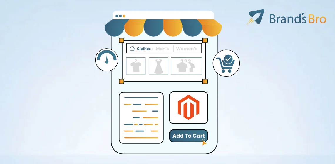
Keep It on One Page
Multi-step checkouts might look organized, but they often break momentum. A one-page layout helps users see the full process at once. Shipping, billing, and payment all live together, so there’s no guessing what’s next. If you can’t make it one step, use a progress bar so shoppers always know where they are.
Show Trust Upfront
Your customers are about to hand over sensitive information. Help them feel safe. Use SSL badges, recognizable payment icons (Visa, PayPal, Apple Pay), and short phrases like “Secure Checkout” or “Encrypted Payment.” These details seem small, but they build instant confidence.
Make It Predictable
Use familiar UI patterns-consistent button placement, clear field labels, and confirmation messages that reassure the user. Let browsers autofill addresses, detect country codes automatically, and save information securely for returning users. Predictability reduces hesitation.
Be Transparent About Costs
Hidden fees kill trust faster than anything else. Display shipping, tax, and total cost before the final click. Magento lets you configure this easily, and it’s one of the simplest ways to reduce abandonment.
Watch your analytics. If users drop off at the payment step, the problem isn’t always your payment gateway-it could be a trust issue or a last-minute surprise in total cost. Fix those first, and you’ll see conversions climb.
Why UX Is the Core of Magento Conversion Rate Optimization (CRO)
If you want to boost conversions in Magento, don’t start with ads or keywords-start with experience. UX design is what turns interest into action.
Every second someone spends waiting, guessing, or reloading is a second they’re reconsidering. When the experience feels smooth, they don’t stop to think; they just buy.
Magento is powerful, but it’s not lightweight. Big catalogs, heavy JavaScript, and multi-step checkouts can all slow things down. That’s where UX becomes a strategy. A site that loads in under three seconds and guides users clearly can outperform a “prettier” site that makes people wait.
The math is simple: Conversion Rate × Average Order Value = Revenue per Visitor (RPV). Improve either one, and you grow. Improve both through better UX-faster load times, cleaner navigation, and simpler checkout – and your revenue doesn’t just rise, it compounds.
Here’s proof. One Magento store reduced its Largest Contentful Paint (LCP) from 5.2 seconds to 2.3, simplified its product detail page layout, and saw a 23% increase in conversions within two months. No ad spend. No gimmicks. Just a faster, easier experience.
That’s what great UX does-it doesn’t just make your store look good. It makes it work better.
Navigation & Product Discovery: Reduce Time-to-Product
A great Magento store feels like walking into a well-organized shop-you instantly know where everything is. Shoppers shouldn’t need to “figure out” your site.
Every click should move them closer to the product they want, not deeper into confusion. The faster someone finds what they’re looking for, the higher your chance of turning that visit into a sale.
Build Navigation That Thinks Like a Shopper
Forget technical hierarchies and think human. Group products by intent-“Shop by Need,” “Shop by Style,” “Shop by Occasion”-instead of internal categories.
Use mega menus that reveal top options at a glance without overwhelming the screen. Keep top-level links short, and make the most-clicked paths prominent.
Use Faceted Filters to Cut Decision Time
Faceted or layered navigation is where Magento shines. Filters like size, color, price, and brand help users narrow results fast.
Each filter removes noise and increases focus. Done right, (Navigation → reduces → Time-to-Product). Done wrong, it clutters the experience. Keep filters simple, relevant, and easy to reset.
Make Search Smarter, Not Just Faster
Your search bar is your store’s personal guide. Power it with ElasticSearch, and teach it synonyms (“hoodie” = “sweatshirt”). Add autosuggest so results appear as users type.
Track zero-result searches in your analytics – those are missed sales opportunities waiting for better keywords or tagging.
Optimize Product Listing and Detail Pages (PLP/PDP)
Product Listing Pages (PLPs) should make comparison easy-consistent product cards, visible prices, and “Add to Cart” buttons above the fold. On Product Detail Pages (PDPs), keep essentials front and center: title, price, variant selector, reviews, and one clear CTA. Every second a shopper spends scrolling for basics is a sale at risk.
Pro Tip: Review your click-tracking heatmaps. If users hover over menus or filters without acting, your labels aren’t clear enough. Rename them to match how customers actually search, not how your CMS is structured.
Performance & Mobile-First UX: Every Millisecond Counts
Speed isn’t a luxury in eCommerce-it’s survival. When your Magento store loads fast, shoppers stay engaged, scroll deeper, and buy more. Every millisecond shapes perception. A fast site feels more trustworthy, while a slow one feels broken.
Why Performance Is the New Trust Signal
A 1-second delay can drop conversions by up to 7%. Google’s Core Web Vitals-LCP (Largest Contentful Paint), CLS (Cumulative Layout Shift), and INP (Interaction to Next Paint)-measure how quickly your site loads, stays stable, and responds to taps or clicks. Aim for:
- LCP: under 2.5 s
- CLS: under 0.1
- INP: under 200 ms
Magento’s rich features often make these hard to hit, which is why optimizing performance isn’t optional-it’s a conversion lever.
Choose a Theme That Lifts, Not Drains
Your theme → improves → Core Web Vitals.
Lightweight themes like Hyvä can load 50% faster than Magento’s default Luma because they cut unused scripts, simplify markup, and use modern frameworks like Alpine.js and Tailwind CSS. Faster themes don’t just boost SEO-they directly lift UX metrics and revenue per visitor.
Design for Thumbs, Not Mice
Over 60% of Magento traffic now comes from mobile. A mobile-first layout means designing for the smallest screen first and expanding from there. Keep key actions within thumb reach. Use:
- Sticky “Add to Cart” buttons that follow the scroll.
- Thumb-friendly filters at the top of PLPs.
- A one-column checkout that eliminates zooming and pinching.
Every swipe should feel effortless.
Quick Wins for Faster Loads
- Convert images to WebP or AVIF and enable lazy loading.
- Defer non-critical JavaScript.
- Minimize render-blocking CSS.
- Use HTTP/2 and a CDN for static assets.
Pro Tip: Open Chrome DevTools, run a Lighthouse audit, and focus on “Opportunities.” Fixing just three high-impact items-image size, script deferral, and CSS delivery-can often cut load time in half.
Performance & Mobile-First UX: Every Millisecond Counts
When it comes to Magento, speed isn’t just nice to have-it’s survival. A slow store feels like waiting in a long checkout line. A fast one feels effortless. And here’s the truth: every millisecond matters.
If your page takes longer than three seconds to load, more than half your visitors are already gone. They’re not mad. They’re just gone-on to the next store that loads faster. That’s why performance and mobile-first UX are the real backbone of your conversions.
The Core Web Vitals That Matter
(Core Web Vitals → measure → user experience quality)
Google doesn’t just guess what makes a good site-it measures it. You’ll hear three terms a lot:
- LCP (Largest Contentful Paint) → How fast your main content loads. Aim for under 2.5 seconds.
- CLS (Cumulative Layout Shift) → How stable your layout is. Ever had a button move just before you tap it? That’s CLS. Keep it below 0.1.
- INP (Interaction to Next Paint) → How quickly your site reacts when someone clicks or taps. Keep it under 200 ms.
Together, these metrics show how real people experience your site. Faster, smoother interactions = better UX = higher conversions.
Themes That Power Performance
(Theme → improves → Core Web Vitals)
Your theme is the foundation of your store’s speed. Magento’s default Luma theme is functional but heavy-it loads unnecessary JavaScript and CSS by default. That’s where Hyvä Theme changes the game.
Hyvä replaces bulky front-end code with modern tech like Tailwind CSS and Alpine.js, cutting page load times by up to 50%. That means faster rendering, smoother scrolls, and happier shoppers.
If your store runs on Luma, upgrading to Hyvä is like switching from a pickup truck to a race car. Same store, twice the speed.
Mobile-First UX: Design for Thumbs, Not Mice
More than 60% of eCommerce traffic comes from mobile devices. If your site isn’t designed for small screens, you’re ignoring most of your customers.
Here’s what works:
- Sticky “Add to Cart” Buttons – Always visible, no scrolling required.
- Thumb-Friendly Filters – Keep filters big enough for human fingers, not precision clicks.
- One-Column Checkout – Stack content vertically so it fits on one hand-held screen.
(Responsive Design → improves → accessibility and conversion)
Good mobile UX doesn’t mean shrinking your desktop design. It means rethinking it for real-world behavior.
Quick Wins for Magento Performance
(Image Optimization → reduces → load time)
(Deferred JS → improves → interactivity)
You don’t always need a full rebuild to go faster. Start with these:
- Optimize images – Convert them to WebP or AVIF formats. Add lazy loading so off-screen images wait to load until needed.
- Defer JavaScript – Let the important stuff (like product content) load first.
- Minimize CSS – Merge and compress files to cut download size.
- Use caching – Built-in Magento caching and CDNs like Cloudflare can cut server strain instantly.
Pro Tip: Run a Lighthouse audit or use Chrome DevTools. Focus on the “Performance” tab. Small fixes there can yield big jumps in Core Web Vitals.
Example: Real-World Results
A Magento store selling outdoor gear switched from Luma to Hyvä. They optimized their product images, enabled lazy load, and compressed scripts. The result?
- LCP: 4.9s → 2.1s
- CLS: 0.22 → 0.05
- Mobile Conversion Rate: +27% in 45 days
Performance wasn’t just a tech win- it became a business win.
When your store loads fast, shoppers don’t think about speed-they think about buying. That’s how performance turns into trust, and trust turns into sales.
- Magento UX Design → drives → CRO.
- Performance → drives → user satisfaction.
- User satisfaction → drives → revenue.
UI Patterns & Visual Hierarchy: Design for Clarity and Trust
Great design doesn’t shout – it guides. In Magento, your goal isn’t to impress visitors with clever visuals, it’s to help them understand what to do next without thinking.
A clean layout, consistent buttons, and well-placed content build confidence faster than flashy animations ever could. That’s the heart of the “Clarity > Creativity” principle.
Why Do Patterns Matter?
(UI Patterns → reduce → cognitive load)
Your shoppers don’t want to learn how your site works; they expect it to work like every other store they trust.
Keep button colors consistent. Use the same shape and position for “Add to Cart” everywhere. Maintain a predictable flow: product images left, details center, call-to-action right. Repetition isn’t boring-it’s comforting.
Whitespace also matters. It’s not empty space-it’s breathing room. Crowded layouts force the eye to work harder, and tired eyes don’t convert.
Think of whitespace as a pause between thoughts, helping customers focus on what’s important.
Product Detail Page (PDP): The Decision Zone
Your Product Detail Page is where most buying decisions happen. This is the moment where shoppers shift from “interested” to “ready.”
Keep all essentials above the fold:
- Product title and short description
- Price and available options (color, size, variant)
- One clear “Add to Cart” button
- Visible trust signals (reviews, badges, stock info)
Each of these elements reduces hesitation. If a customer has to scroll for basic details, you’ve already lost their focus.
Build Trust Through Microcopy and Signals
(Trust Signals → increase → Purchase Confidence)
Trust is earned one small detail at a time. Use microcopy-short, reassuring text near key actions – to remove doubt:
- Free Returns within 30 Days
- Ships in 24 Hours
- Secure Payment Powered by Stripe
These phrases may look tiny, but they’re powerful. They answer unspoken questions before they stop a sale.
Add visual trust anchors: star ratings, verified badges, and social proof. Use icons that are easy to recognize. A simple padlock icon beside “Checkout” can raise confidence more than a long paragraph about security.
Pattern Libraries: Keep It Consistent
(Pattern Library → ensures → visual consistency)
If your store uses Magento’s Page Builder, create a shared pattern library for buttons, cards, and product layouts. It’s your brand’s playbook. This ensures every designer, developer, or marketer keeps the same visual language-same spacing, same tone, same message.
A consistent experience builds subconscious trust. When everything feels familiar, users stop worrying about how to shop and focus on what to buy.
Pro Tip: Before launching a redesign, show your PDP to someone unfamiliar with your site for five seconds. Ask what they remember. If they can’t tell you the product name, the price, or how to buy it, your hierarchy needs work.
Checkout Optimization: Remove Every Possible Friction
If your checkout feels like a chore, people won’t finish it. It’s that simple. The checkout is your store’s final handshake-a moment where shoppers either commit or walk away. Every second, every extra field, every unclear message adds friction. And friction kills conversions.
The Goal: Make Checkout Feel Effortless
(Checkout Optimization → reduces → Cart Abandonment)
The smoother the path, the higher the completion rate. You’re not just collecting data-you’re guiding someone through their final decision. Checkout optimization is about removing obstacles, not adding features.
The math is simple: if 100 people add to cart and only 30 buy, 70 didn’t say “no”-they said, “this is too hard.” That’s where UX steps in.
One-Step Checkout: Everything in One Place
(One-Step Checkout → reduces → Steps → increases → Conversion)
Multi-step checkouts feel like waiting in line. Each click adds a chance to quit. A one-step checkout layout shows all fields-shipping, billing, and payment-on a single, clean screen. Users can see what’s next, fill in details faster, and finish in seconds.
Magento makes this easy with trusted tools like:
- Amasty One Step Checkout → combines fields, supports auto-fill, and tracks drop-offs.
- Aheadworks Smart Checkout → remembers last-step data, so users can come back without starting over.
Real impact: Stores switching to one-step checkout often see conversion increases of 15–35% within weeks.
Guest Checkout: Skip the Commitment
(Guest Checkout → reduces → Friction)
Forcing users to create an account before buying is like asking someone to sign up for a gym before they try a treadmill. Let them buy first. Then ask if they want an account.
Guest checkout removes the wall between intent and purchase. It tells users, “You don’t have to trust us forever-just for this order.” That small gesture builds confidence.
Pro Tip: Offer optional account creation after checkout with a single click: “Save your details for next time?” Simple. Friendly. Optional.
Payment Gateways: Trust Is in the Details
(Payment Gateways → increase → Purchase Confidence)
Shoppers don’t think about payment gateways-until they don’t trust them. Display recognizable logos like PayPal, Stripe, Apple Pay, or Google Pay right where they’ll pay. Those logos work as mini trust signals that whisper, “You’re safe here.”
Add security seals and short microcopy like “Encrypted Payment” or “We never store card details.” These words remove hesitation faster than any design tweak.
Design Checkout for Mobile First
More than half your buyers are checking out on phones. And yet, many stores still design for desktops first. Big mistake.
(Mobile Checkout → improves → Completion Rate)
Here’s your mobile-friendly checklist:
- 5 fields or fewer visible above the fold.
- One-column layout only.
- Buttons large enough for thumbs, spaced to avoid mis-taps.
- Auto-fill enabled for address and payment.
- Sticky “Complete Order” button visible at all times.
Speed matters too. Even a half-second delay on mobile checkout can cut conversions by up to 10%.
Transparency Builds Trust
Surprises belong in gift boxes, not checkout pages. Show taxes, shipping, and total cost before the final click.
(Transparent Pricing → increases → Trust)
If you hide fees until the last second, users will assume you’re hiding more. Be upfront-it’s one of the simplest ways to lower abandonment and increase lifetime trust.
Pro Tip: Add real-time shipping estimates. Magento supports this out of the box, and it instantly tells shoppers, “You’ll get your order by Tuesday.” That small line reduces drop-offs dramatically.
Bring It All Together
Here’s the full chain in action:
- Checkout Optimization → reduces → Cart Abandonment
- Guest Checkout → reduces → Friction
- Payment Gateways → increase → Confidence
- Mobile Design → improves → Completion Rate
- Transparent Pricing → builds → Trust
When these pieces work together, checkout becomes invisible-it just flows.
Real-World Example
A Magento clothing brand had a 68% cart abandonment rate. They switched to Amasty One Step Checkout, enabled guest checkout, and added Apple Pay. Within 30 days:
- Checkout time dropped from 2:45 to 1:10.
- The completion rate jumped by 21%.
- Mobile sales grew 28%.
Same products, same traffic-just a smoother path.
A great checkout isn’t flashy. It’s quiet, clear, and fast. It removes hesitation, not adds pressure. Do that well, and your Magento store won’t just sell-it’ll convert effortlessly, every time.
Personalization & Behavioral Design: Make Every Shopper Feel Seen
Imagine walking into a store where the shelves rearrange themselves just for you. Your favorite colors up front, your size in stock, and the exact item you looked at last week waiting on the counter. That’s what smart personalization does for your Magento store.
What Personalization Really Means
(Personalization → uplifts → RPV)
Personalization isn’t guessing. It’s using real data-first-party data-to make shopping feel effortless. Magento can track what products people view, what they add to cart, and what they ignore. You then use that behavior to serve relevant content, not random noise.
When you personalize right, you’re not selling harder. You’re helping faster. That’s what raises Revenue per Visitor (RPV) and Average Order Value (AOV).
Learn From User Behavior
(User Behavior → informs → Personalized Experience)
People leave digital clues with every click. Product views, dwell time, scroll depth-all small signals that reveal intent. Magento’s built-in analytics and product recommendation engine use this data to show what each shopper is most likely to want next.
Example: if someone views running shoes, don’t show them hiking boots. Show them socks, insoles, or matching shorts. That’s not marketing-it’s logic that feels personal.
Smart Ways to Personalize in Magento
Here’s how to put personalization into action:
- Dynamic Product Banners on PLP or PDP pages. Show “Recently Viewed” or “Recommended for You.”
- Cross-Sell and Upsell Modules using Magento Product Recommendations.
- Tailored Offers in the cart: “Add a $20 item to unlock free shipping.”
- Geo-based Personalization: show local currency, nearest store, or shipping times by region.
Every one of these steps says, “We see you.”
Use Microcopy to Build Trust
(Microcopy → clarifies → Delivery Expectations)
A little text can remove big doubts. Clear, friendly phrases like:
- “Order within 3 hours to ship today.”
- “Free returns for 30 days.”
- “Your size ships faster from our UK warehouse.”
These details make shopping feel predictable. Predictability creates comfort, and comfort turns into conversions.
Keep It Ethical and Fast
Personalization should help, not creep. Always let users know how their data is used and give them control. Respect privacy laws like GDPR.
And don’t let personalization slow your site. Heavy scripts and tracking pixels can kill performance – and a slow site will undo all that personalization magic.
(Performance → supports → User Trust)
If it doesn’t load fast, it doesn’t matter how “personal” it is.
Quick Example
A Magento cosmetics brand started using personalized PLP banners and product bundles based on browsing history. They saw:
- +22% in AOV
- +18% in RPV
- +30% return visits
No ads. No gimmicks. Just showing shoppers what they actually wanted.
Pro Tip: Start small. Personalize just one area – like “Recommended Products”-and track results for a month. Once you see the lift, expand it across categories and email flows.
Personalization isn’t about technology. It’s about empathy – understanding what your customer wants before they have to ask. Do that well, and your Magento store won’t just sell products. It’ll make people feel seen, understood, and eager to come back.
Measure, Test, and Iterate: The CRO Feedback Loop
The best Magento stores aren’t built once – they’re improved every week. You don’t guess what works. You test it. Because what feels “good” to you might confuse your shoppers. And in conversion rate optimization (CRO), guessing is expensive.
The CRO Formula That Actually Works
(A/B Testing → drives → Continuous Improvement)
Every successful store runs on a simple loop:
- Define your hypothesis: A sticky Add to Cart button will increase clicks by 10%.
- Build your variant: Use Magento Page Builder to test new layouts or content fast.
- Run the experiment: Split traffic between version A (original) and version B (your test).
- Analyze the results: Check conversions, time on page, and engagement.
- Deploy the winner: Keep what works. Learn from what doesn’t. Then test again.
That’s your CRO feedback loop-simple, repeatable, and powerful.
Track Real Behavior with GA4
(GA4 Events → reveal → User Behavior)
Magento connects easily with Google Analytics 4, which tracks events like:
- add_to_cart
- Begin_checkout
- purchase
These tell you where shoppers drop off in the funnel. For instance, if 70% click “Add to Cart” but only 20% start checkout, that’s your friction point.
Don’t just look at averages. Follow the journey from Product Detail Page (PDP) → Cart → Checkout → Purchase. That’s where real optimization happens.
Use Tools That Make Testing Easy
(Tools → enable → Experimentation)
You don’t need to code every change. Tools like Adobe Target, VWO, and Convert let you test headlines, buttons, or layouts without touching PHP.
Even though Google Optimize 360 is retired, many Magento stores now use VWO or Convert Experiences for A/B and multivariate tests.
And because Magento Page Builder is modular, you can launch variants in minutes-not weeks.
Simple Test Ideas That Work
Small changes can have big results. Try these first:
- PDP image layout → Test gallery vs. single hero image.
- Checkout progress bar → See if showing steps improves completion.
- Sticky CTA → Keep “Add to Cart” visible on scroll.
- Microcopy test → “Add to Cart” vs. “Get Yours Now.”
Pro Tip: Run one test at a time. If you test too many things at once, you’ll never know which one caused the change.
Heatmaps: The Truth in Color
(Heatmaps → visualize → User Interaction)
Tools like Hotjar or Microsoft Clarity show you where users click, scroll, or stop. If people ignore your top banner but click your footer, that’s a design signal-not a mystery.
Use heatmaps to pair with A/B testing. It’s the perfect one-two combo: numbers tell you what is happening, heatmaps show you why.
The Real Power of Iteration
Optimization is never “done.” Your shoppers change. Devices change. Behavior changes. Testing keeps you aligned with them.
Think of CRO like working out-you don’t get fit once and stop. You train, measure, and adapt. The more you iterate, the sharper your UX and the higher your conversions climb.
Internal Link: Magento A/B Testing: What to Test for Maximum ROI
When you measure, you learn. When you test, you improve. And when you keep iterating-your Magento store doesn’t just sell. It evolves.
Implementation Roadmap & Prioritization Matrix
You can’t fix everything at once – and you don’t have to. Great Magento optimization happens in phases. Start small, stack results, and build momentum. The key is knowing what to do first for the biggest return.
That’s where the Impact × Effort Matrix comes in. It helps you rank tasks by how much they’ll move the needle versus how hard they are to pull off.
Quick Wins (High Impact, Low Effort)
These are the fast fixes. They take little time but make a huge difference.
- Image Compression: Convert images to WebP or AVIF and enable lazy loading. It can cut load time by 40%.
- Sticky Add to Cart (ATC): Keep the CTA button visible while users scroll. This alone can lift conversions by 10–15%.
- Guest Checkout: Remove forced account creation. It instantly reduces friction and boosts completion rates.
(Quick Wins → increase → Conversion Rate)
Focus on these first. They’re like cleaning your store’s front window-you’ll see results right away.
Medium-Term Projects (Balanced Impact & Effort)
Once your quick wins are live, move to the middle layer – projects that take planning but pay off big.
- Theme Upgrade (Hyvä): Replace the bulky Luma front-end. Hyvä loads up to 50% faster and boosts Core Web Vitals.
- Refine PLP Filters: Simplify and reorder filters so users find products faster. Better navigation means higher engagement.
- Personalization Modules: Use Magento’s Product Recommendations to show tailored items and increase Revenue per Visitor (RPV).
(Personalization → uplifts → RPV)
(Hyvä Theme → improves → Core Web Vitals)
These changes take more time but deliver sustained growth.
Long-Term Goals (High Impact, High Effort)
Now you’re playing the long game. These are strategic upgrades that redefine your store’s performance.
- Headless or PWA Frontend: Decouple Magento’s back-end from your front-end for lightning-fast performance on any device.
- Continuous CRO Cycle: Keep testing and improving every quarter using A/B testing, GA4 events, and heatmaps.
- UX-Driven Redesign: Redefine your store layout based on real data, not assumptions.
(CRO Loop → drives → Long-Term Optimization)
These projects take months, but they future-proof your store.
Prioritize Using the Impact × Effort Grid
Here’s how to plan:
Impact | Effort | Examples |
High | Low | Image compression, sticky ATC, guest checkout |
High | Medium | Hyvä theme, personalization, PLP refinement |
High | High | Headless frontend, CRO cycle |
Low | High | Cosmetic design tweaks, non-essential animations |
This grid keeps you focused. Always aim for the top-left corner-high impact, low effort. That’s where growth happens fastest.
Start small, measure everything, and scale what works.
When you prioritize smart, your Magento store grows steadily-not by luck, but by design.
Every win stacks. Every test teaches. And every step moves you closer to a store that’s not just fast-but unstoppable.
Conclusion
Better UX leads to better results-it’s that simple. A smoother experience means happier shoppers, higher conversion rates, and stronger Revenue per Visitor (RPV). When navigation, checkout, and performance align, revenue doesn’t just grow-it compounds.
Treat your Magento UX like a living system, not a one-time project. Run a full UX audit every six months to catch friction before it costs sales.
Ready to see where your store stands?


