
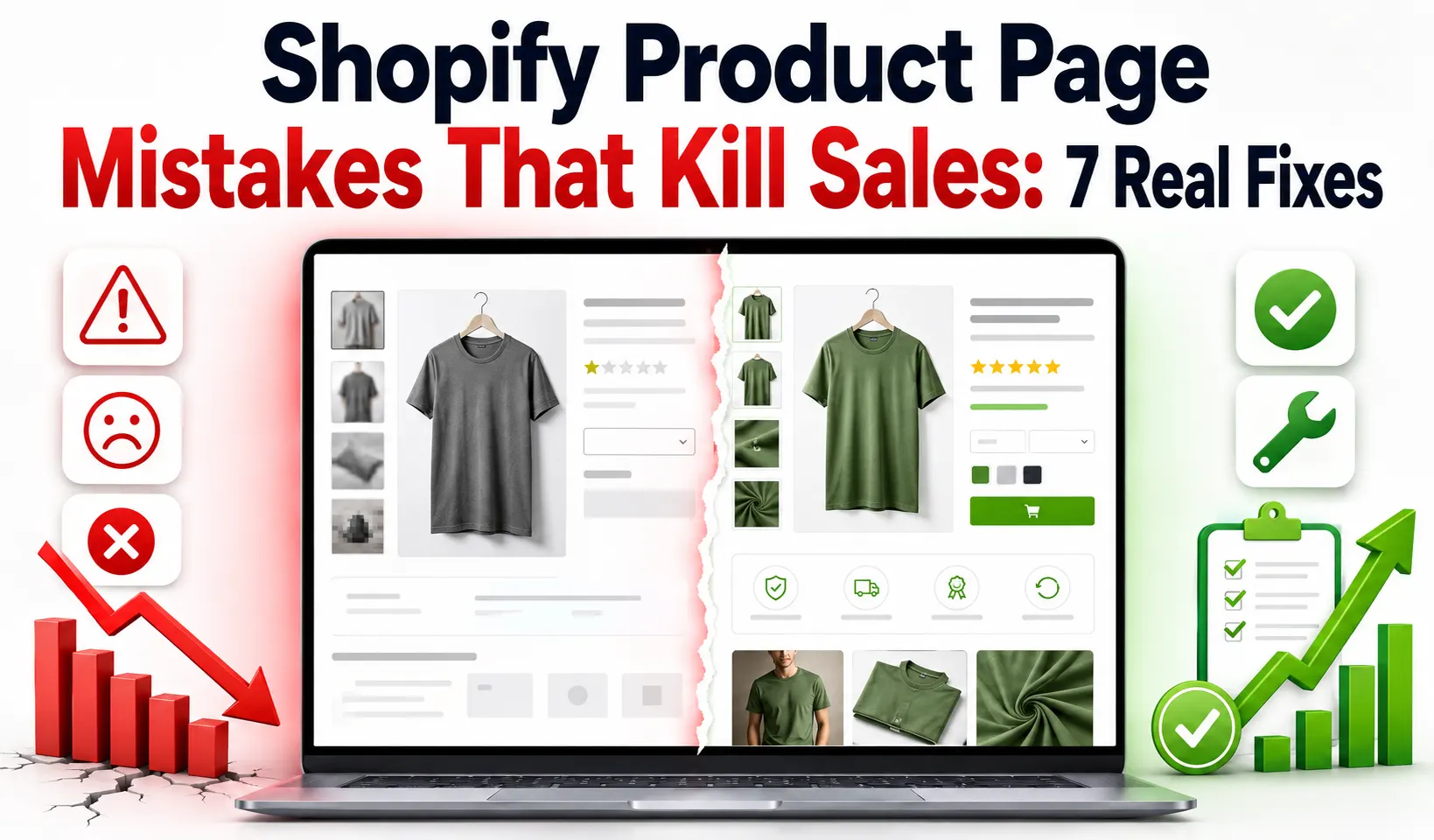
Your product pages get traffic, yet the add-to-cart rate stays flat. Shoppers land, scroll for a moment, then leave. The page fails to answer what a buyer needs.
Most owners react by spending more on ads. That move sends more traffic to a leaking page. A broken page wastes every extra click you pay for.
These are the Shopify product page mistakes that kill sales for stores across the USA. Each one creates doubt before the shopper reaches checkout. The page loses the sale where that doubt appears.
This guide covers seven mistakes that stall a product page. Each one maps to a fix you can ship this week. The first mistake sits in the first screen.
Why Do Shopify Product Pages Get Traffic But No Sales?
Shopify product pages fail to convert when they create doubt before the click. A shopper needs to grasp the product and trust the offer. One missing piece in that chain stops the sale.
The first screen decides whether a shopper stays or leaves. A weak headline or a dull main image sends the visitor away. Shopify product page conversion starts with the content a buyer sees first.
Doubt builds in small steps down the page. A missing review or an unclear variant adds hesitation. Shopify product page optimization removes those doubts one section at a time.
The fix order matters as much as the fixes. You repair the first screen before the copy or the trust layer. A clear page earns the click a cluttered page loses.
7 Shopify Product Page Mistakes That Kill Sales
Seven mistakes explain most cases of a stalled product page. Each one below ties to a point of buyer doubt. The first mistake sits in the headline.
1. The headline is weak or vague
A vague headline makes a shopper work to understand the product. A title like “Premium Bottle” says nothing useful. The buyer should grasp the product within two seconds.
Your headline names the product and its main benefit. A title naming the size and the key trait answers the buyer’s question. Shopify product page copywriting turns a flat title into a reason to read on.
The subheadline supports the promise with one concrete detail. A line about material or a guarantee reduces early doubt. Resolving a Shopify product description problem holds the shopper long enough to reach the images.
2. The product images are poor or incomplete
A single low-quality photo gives a shopper no reason to trust the product. Online buyers cannot touch the item, so images carry the proof. A Shopify product image problem shows as high traffic with a low add-to-cart rate.
Your gallery needs a clean main image plus scale and lifestyle shots. A close-up of the material answers a question copy cannot. A short product video lifts buyer confidence further.
A professional Shopify CRO service maps the image types that raise conversion. Each added angle removes one reason to hesitate. Leaving visual gaps open leaves that doubt unaddressed.
3. The page lists features but no benefits
A page full of specs with no benefits leaves the shopper guessing. A spec like “600ml capacity” means little on its own. The buyer wants to know what the product does for them.
Your copy pairs each feature with the outcome it delivers. A capacity line tied to a full day of use names the benefit. A Shopify product description problem appears when copy reads like a data sheet.
You cover the top buyer questions inside a short FAQ. One section on sizing or care removes a common doubt. Effective Shopify product page copywriting moves a shopper from interest to intent.
4. The page has no reviews or trust signals
A product page with no reviews gives a shopper no social proof. Buyers trust other buyers more than they trust brand claims. A page without ratings loses shoppers who need proof first.
Your page shows star ratings and a few detailed reviews with photos. A thorough conversion audit maps where trust signals raise the add-to-cart rate most. Trust badges and a clear return policy lower buyer risk.
Strong Shopify product page trust signals answer the safety question a shopper asks. A visible guarantee near the button closes the gap to action.
5. The variant selector confuses shoppers
A confusing variant selector makes a shopper guess which option to pick. A dropdown with unclear labels slows the choice. One buyer who cannot pick a size with confidence often leaves.
Your variant selector uses color swatches and a clear size guide. One swatch shows the real color faster than a text label. A size guide near the selector answers the fit question early.
You hide out-of-stock variants so the shopper avoids a dead end. One greyed-out option with a restock note beats a broken click. Clear variant UX and clean Shopify product page design keep the buyer moving toward checkout.
6. The page hides shipping cost and delivery time
A surprise shipping cost at checkout is a top reason for abandoned carts. Shoppers want the total cost before they commit. A page that hides shipping until checkout breaks trust.
Your product page states shipping cost and delivery time near the price. A free-shipping line with a delivery estimate removes a common doubt. Clear shipping terms on the page prevent checkout abandonment later.
You place the return policy where a hesitant buyer sees it. A 30-day return note lowers the risk a first-time buyer feels. Clear Shopify product page trust signals keep the shopper from bouncing at checkout.
7. The page loads slowly or breaks on mobile
A slow product page loses buyers before the content appears. Most Shopify traffic lands on a phone, so mobile speed matters. Shopify’s web performance report shows Core Web Vitals like loading speed.
Your page needs a fast first paint and a large tap target. A sticky Add to Cart button keeps the buy action in reach. Heavy apps and oversized images slow the page and cost sales.
Skilled Shopify development work trims the code that drags a mobile page down. One page that loads under three seconds holds more buyers. Mobile speed protects the traffic your ads worked to earn, solving a major cause of a Shopify product page not converting.
How to Diagnose a Product Page That Does Not Convert?
You diagnose a weak product page by watching where shoppers drop off. Shopify product-page analytics show the add-to-cart rate and scroll depth. One low number points to the section that loses the buyer.
A low add-to-cart rate with high traffic points to the first screen. Few scrolls past the images point to a Shopify product image problem. A high cart-to-checkout drop points to the shipping cost.
The table below maps each symptom to the mistake behind it. One symptom tells you which fix to run first. A clear read saves you from guessing at the wrong section.
Symptom | Likely mistake | First fix |
Low add-to-cart rate | Weak headline or images | Rewrite the first screen |
Shoppers leave fast | Slow mobile page | Trim apps and images |
Cart but no checkout | Hidden shipping cost | Show cost on the page |
Wrong variant picked | Confusing selector | Add swatches and size guide |
No scroll past images | Poor image set | Add angles and lifestyle shots |
A ranked read turns a vague slump into a clear next step. One fix at a time keeps the data readable. The next section sets the order you fix these mistakes.
What to Fix First on a Shopify Product Page
You fix the first screen first because it decides whether a shopper stays. A clear headline and a strong main image hold the visitor. That single screen carries the most weight on the page.
Images and copy come next, since they build the case to buy. A Shopify product page checklist keeps the fix order consistent across products. Benefit-led copy and a full image set move a shopper toward intent.
Trust and mobile speed follow once the content is clear. A structured audit process also covers reviews and shipping clarity. The table below ranks each fix by speed and sales impact.
Fix | Speed | Sales impact |
Rewrite the headline | Fast | High |
Add product images | Fast | High |
Add reviews and trust badges | Medium | High |
Show shipping and returns | Fast | Medium |
Fix variant selector | Medium | Medium |
Speed up the mobile page | Medium | High |
A ranked plan stops you from spreading effort across every mistake. One fix per section keeps the impact traceable. The next section shows how our team runs this repair.
How Our Team Rebuilds Product Pages That Sell
Our team has rebuilt Shopify product pages for stores for over 10 years. We start each project with an analytics review and a mobile speed test. From there, we fix the first screen and then the images.
Most pages we rebuild show a higher add-to-cart rate within weeks. One client lifted conversions after we added reviews and a sticky button. A clean rebuild turned a leaking page into a steady seller.
Better Shopify SEO feeds the organic traffic that a strong page converts. We map the doubts across your headline, images, and offer using a Shopify product page checklist.
Common Shopify Product Page Mistakes That Cost You Orders
Most stalled product pages repeat the same short list of errors. Each one below ties to a fix from the seven sections above.
- A vague headline that hides the product benefit.
- A single low-quality image with no scale shots.
- Copy that lists specs with no buyer benefit.
- A page with no reviews or visible trust signals.
- A confusing variant selector with no swatches.
- A hidden shipping cost that surprises the buyer.
- A slow mobile page that loses buyers early.
Shopify’s own guide to better product pages covers many of these same errors. Strong Shopify product page design removes the friction that stalls a buyer. A clean layout keeps every section ready to convert.
Frequently Asked Questions (FAQs)
Store owners with low product page sales ask some common questions. The answers below clear up all the confusion.
Your page likely creates doubt before the Add to Cart click. A weak headline or a hidden shipping cost stops the sale.
The first screen carries the most weight since it decides whether a shopper stays. A clear headline and a strong main image hold the visitor.
A product page needs a main image plus scale and lifestyle shots. Five to seven images cover the angles a shopper needs.
Yes, reviews give the social proof a shopper needs before buying. A page with ratings converts better than one without them.
A surprise shipping cost at checkout is the top reason for this drop. You show the shipping cost on the product page to prevent it.
You trim heavy apps and compress the product images. A page that loads under three seconds holds more mobile buyers.
The title, main image, price, and Add to Cart button belong above the fold. A shopper should grasp the offer without scrolling.
Yes, strong Shopify product page SEO brings buyers who already search for the product. Higher organic visibility feeds a page that a clear layout converts.
Fix the Product Page Before You Spend More on Ads
The Shopify product page mistakes that kill sales all share one root cause. Each one creates doubt before the shopper reaches the Add to Cart button. A clear page removes that doubt from headline to checkout.
You fix the first screen first, then the images and trust signals. A Shopify product page not converting issue often traces to these seven mistakes. Variant clarity and mobile speed close the last gaps before checkout.
A clean optimization fix earns more from your current traffic. The page rewards the store that reads its analytics each week. A tested, tighter page today protects the sales you earn tomorrow.
