
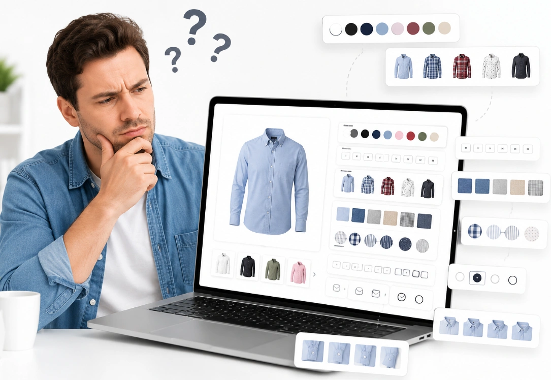
Your product looks great. The photos pop. Reviews shine below them. Then a shopper reaches the options and leaves.
That drop-off has a cause. Buyers do not fail at checkout first. They freeze at the variant picker when it hides stock or price.
So here is the honest issue. Shopify product variants confusing customers is a conversion problem across the USA. A shopper who cannot pick a size or color will not buy.
Most guides show how to create Shopify product variants. Few show how product variants shape the choice. Your Shopify product page UX decides whether a shopper clicks add-to-cart. The first step is a plain definition of a variant.
What Are Shopify Product Variants? Options and Values
Shopify product variants are the sellable versions built from a product’s options. An option is a trait like Size, and its values are Small or Large. A variant is one full combination, like Small and Blue.
Each variant holds its own price, image, and stock count. The Shopify editor stores these fields per variant, not per product. This is the layer a shopper picks from on the page.
Shopify caps a product at three options on every plan. Eligible stores can now hold up to 2,048 variants each. Shopify product options beyond three names need a separate app.
Rule | Limit | Note |
Options per product | 3 | The same cap on every plan |
Variants per product | Up to 2,048 | Raised from 100 for eligible stores |
Images per product | 250 | Split with combined listings for more |
Custom text fields | No cap | Use line item properties instead |
These caps decide how many Shopify product variants land on one page. A large set turns the picker into a wall of buttons. That overload leads straight to why buyers freeze next.
Why Shopify Product Variants Confuse Shoppers: The Quick Answer
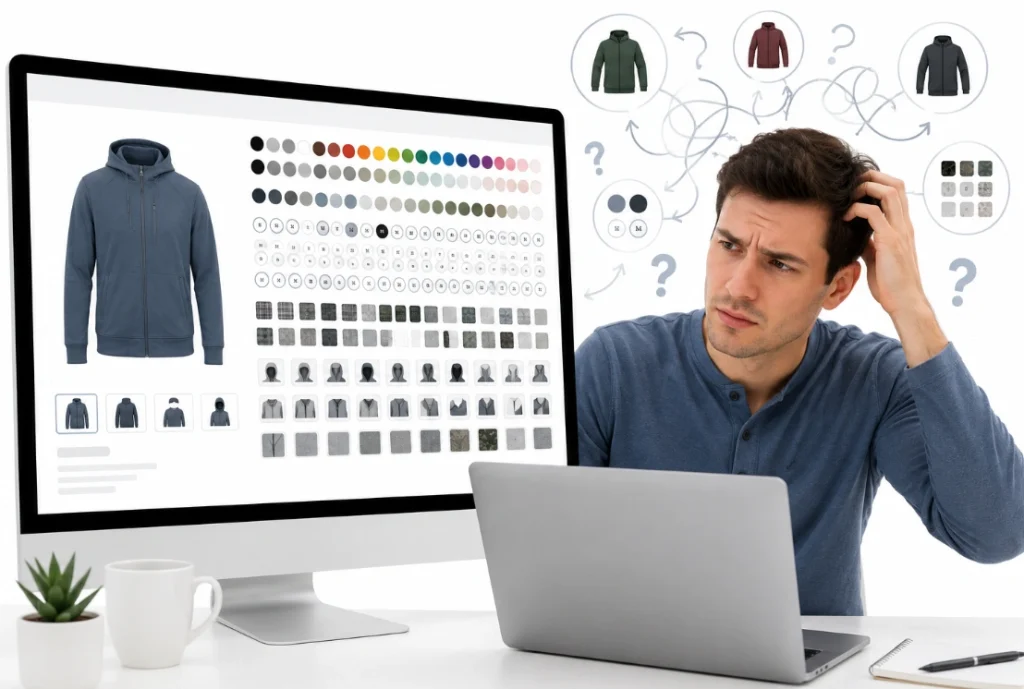
Shopify product variants confuse shoppers when the picker hides stock or image. A buyer cannot commit to a choice they cannot see. That hesitation ends in a bounce or a wrong pick.
You can trace lost sales to Shopify product variants confusing customers on the page. A dropdown that hides sizes adds a tap and a doubt. Color shown as text hides the shade until checkout.
Each of these gaps has a measurable fix later in this guide. Better Shopify variant design means one clear choice at each step. First, here is how to spot the friction on your own page.
How To Spot Variant Friction On Your Product Page
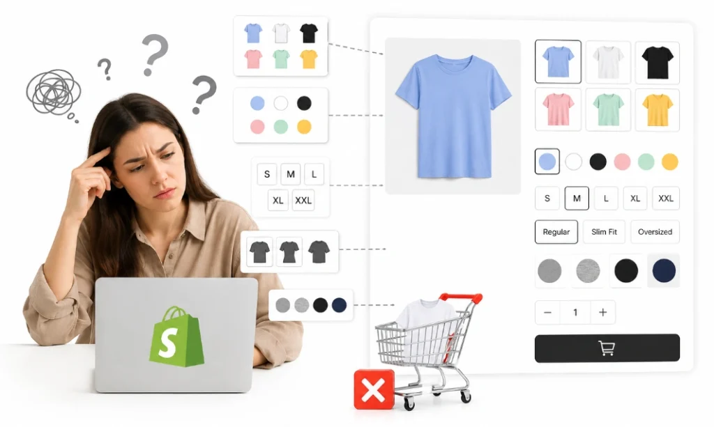
You spot variant friction where shoppers pause or mis-tap. Session recordings show taps on options that lead nowhere. A rising return rate signals wrong picks at the option step.
Support tickets name the confusion in the buyer’s own words. Repeat questions about size or color expose a weak Shopify variant selector. Each ticket points to the option that fails most.
The clearest signal is add-to-cart drop-off on the product page. Shopify variants not converting often trace to the picker, not the price. Next, see what that friction costs in conversion and returns.
Why Shopify Product Variants Hurt Conversion And Returns
Variant confusion hurts conversion by adding doubt at the last step before payment. A hesitant shopper abandons the cart or leaves the page. The pattern of Shopify product variants confusing customers shows in the metrics.
Wrong Shopify product variants drive returns, plus shipping and restocking costs. A guessed size often ships back within the return window. Each return erases the margin the sale earned.
Clear options lift add-to-cart and cut those returns at once. The payoff shows in both revenue and support load. Those nine causes below are where most confusion starts.
9 Causes Shopify Product Variants Confuse Customers
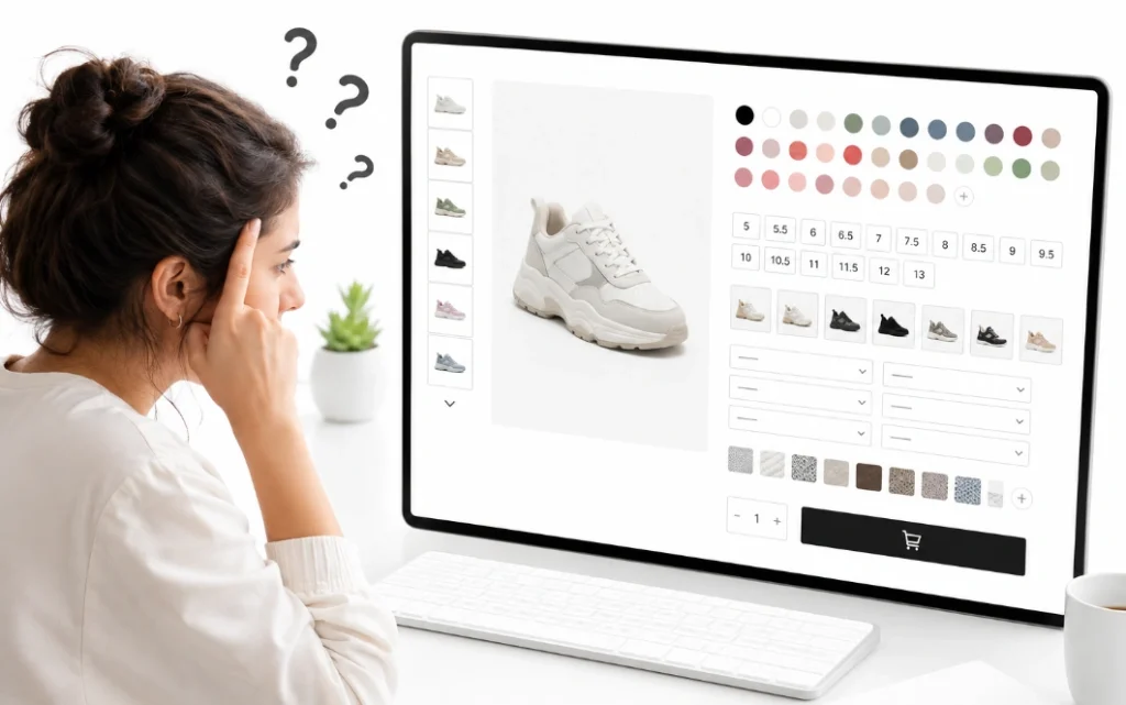
Shopify product variants confuse customers through nine specific gaps. Some Shopify product variants appear together on one product page. The first gap sits in the option names themselves.
Unclear option names blur the choice
Vague option names force shoppers to guess what each value means. Style A and Style B describe nothing a buyer can picture. Names like Crew Neck and V-Neck remove that doubt at a glance.
Option order also steers the choice down the page. Size placed before color reads better for apparel buyers. Clear Shopify product options in a logical order cut the reading required.
Consistent names across products also help a returning buyer move faster. One learned label set speeds every repeat order. The next gap hides those values behind a dropdown.
Dropdown menus hide sizes and add taps
Dropdown menus hide every size value behind one extra tap. Shoppers cannot compare sizes without opening the menu first. Baymard found visible size buttons outperform hidden dropdowns.
Buttons and pills show all values in a single view. A shopper reads stock and choice without a click. Visible Shopify size selector buttons cut the effort at this step.
A dropdown still earns its place for a very long list. Shoe sizes with half steps can overflow a button row. Color is the next value a dropdown struggles with.
Color shows as text instead of a swatch
A color name with no swatch makes shoppers imagine the shade. Labels like Sand or Stone carry no visual meaning. Shopify color swatches show the true shade before any click.
Image swatches work better for prints and woven textures. A small photo shows a pattern that a word cannot. Mobile lists that hide Shopify color swatches lose buyers seeking a set color.
Swatch size matters too, since tiny dots blur close shades. A larger swatch shows the real color at a glance. Fit is the next detail a shopper cannot judge from text.
No size guide leaves fit unclear
A missing size guide leaves fit and body measurements unclear. Shoppers who doubt the fit either leave or over-order. A guide with chest and waist numbers cuts wrong-size returns.
The guide belongs beside the size selector, not in the footer. One tap should open the measurements in place. Fit data at the choice protects both conversion and returns.
A fit chart in inches and centimeters serves buyers worldwide. Matched units stop the doubt that drives returns. The next gap appears when a chosen mix does not exist.
Unavailable combinations still look clickable
Unavailable combinations confuse shoppers when they still look selectable. A Red and Small mix may not exist as a real variant. Shopify returns no variant when the combination has no match.
Disabled swatches with a strikethrough show what is sold out. A shopper sees the gone mix without a dead click. Clear stock states stop the wrong pick before it happens.
Hiding a sold-out value confuses more than a disabled one does. A buyer may not notice the value vanished at all. The next gap shows even when the choice does exist.
The product image does not match the variant
A product image that never changes hides what the variant looks like. The shopper selects blue yet still sees the red photo. Shopify variant images should swap the gallery on each choice.
The main image and thumbnail must match the selected value. A mismatch here breaks trust before the cart loads. Variant media also cuts returns from a surprise color.
Each color needs at least one photo that shows it. A matched gallery turns a guess into a clear preview. Price is the next thing that shifts without warning.
Prices jump with no reason on screen
A price that jumps with no label confuses shoppers mid-choice. Larger packs or premium material cost more for a reason. The page should state why the number moved.
Per-unit pricing lets a shopper compare pack sizes in seconds. A compare-at price shows the saving on a bundle. Honest variant pricing holds trust through the whole checkout.
A three-pack that shows the cost each removes the sticker shock. Clear math at the option step keeps the buyer moving. The next gap hits hardest on a small phone screen.
Mobile selectors are too small to tap
Mobile selectors confuse shoppers when the tap targets are too small. A 44-pixel tap target is the safe minimum on phones. Cramped swatches cause mis-taps and fast exits.
A sticky add-to-cart bar keeps the button within thumb reach. Labels above 14 pixels stop the pinch and zoom. Strong Shopify variant UX on mobile holds the sale to the end.
Most Shopify traffic now arrives from a phone, not a desktop. Mobile fixes protect the largest share of your sales. The last gap appears when one product holds too many variants.
Too many variants crowd one page
Too many Shopify product variants crowd one page and stall the choice. A grid of 40 swatches slows even a sure shopper. Grouping or filtering the values makes the set scannable.
Combined listings split a large product into linked products. Each linked product keeps its own images and URL. This structure trims the load without dropping any option.
A filter above the swatches lets a shopper narrow fast. Choosing color first shrinks a long grid at once. With the causes clear, the fix starts with the right selector.
Selector Types Compared: Dropdown, Buttons, Swatches, Image Tiles
The right selector depends on the option, so each type fits a different value. A dropdown suits a long list like shoe sizes. Buttons suit a short set the shopper should see at once.
Color swatches suit solid shades, while image tiles suit prints. The table below pairs each type with its best use. Choosing the value comes first, then the selector.
Selector | Best for | Why it works |
Dropdown | Long value lists | Saves space for many sizes |
Buttons or pills | Short value sets | Shows all options at a glance |
Color swatches | Solid colors | Shows the true shade fast |
Image tiles | Prints and textures | Shows a pattern words cannot |
The wrong selector adds effort a shopper will not spend. A quick match here lifts the whole Shopify product page UX. Beyond the selector, a few patterns push more clicks to cart.
Variant UX Patterns That Lift Add-to-Cart
A few variant patterns lift add-to-cart across most Shopify stores. The selected state shows which value the shopper chose. A bold border or a highlight marks the active option.
Preselecting the most common value speeds the first choice. Teams that run Shopify CRO test each pattern against real add-to-cart data. A best-selling size can load as the default option.
Inline stock text warns before the final unit sells out. A low-stock note nudges the decision without pressure. One pattern still trips stores up: the sold-out combination.
How To Show Unavailable Variants Without Losing The Sale
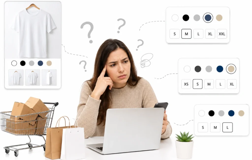
You show unavailable variants by disabling them, not hiding them. A strikethrough on a swatch marks a sold-out mix. The shopper sees the option without a dead-end tap.
A back-in-stock signup keeps that shopper on the page. One disabled state cuts the bounce a dead click causes. Clear stock signals also smaller size and color tickets.
Theme logic decides how each combination maps to a variant. Correct Shopify variant selector logic keeps every mix honest. The next fix keeps the image honest as the choice changes.
How To Update Images And Price By Variant
You update the image and price by tying media and cost to each variant. Shopify links media to a variant inside the product editor. The gallery then swaps when a shopper picks that value.
Large variant galleries can slow the product page load. Careful Shopify image optimization holds page speed as media grows. Compressed variant photos keep detail without the weight.
Price lives at the variant level, not the product level. Each variant carries its own price, matched to its Shopify variant images. That match at the choice builds the trust a sale needs.
When To Use Combined Listings Or A Product Options App
You reach for combined listings or an app once three options run out. Shopify caps every product at three options across all plans. A fourth trait like fit needs another route.
Combined listings join separate products into one storefront view. A theme update can wire those linked selectors into the page. Each linked product keeps its own URL and image gallery.
A product options app adds fields past the three-option cap. These tools keep a complex catalog under the variant limit. Our own team handles this rebuild, as the next section shows.
Line Item Properties For Custom And Personalized Options
Line item properties capture custom input that a variant cannot hold. A gift message or engraving text lives in these fields. They attach to the cart line without adding new variants.
Personalization often needs open text, not a fixed value. A monogram field or a date fits this pattern. These inputs keep the variant count and the SKU list small.
Custom options apps add these fields without deep theme code. Careful setup keeps checkout accurate on every custom order. Behind every field sits the variant data that must stay clean.
Variant Data And SKU Structure Behind The Picker
Clean variant data keeps the picker accurate at every single choice. Each variant carries a SKU, a price and a stock count. Good SKU work maps each combination to real inventory.
A SKU is the code that tracks one variant in stock. Shopify’s SKU setup guide explains how to structure these codes. Clean codes stop the mismatch that hides a variant.
A broken mapping shows options that lead to no variant. Variant metafields store extra detail like a material spec. Those same names also shape how the product ranks in search.
How Variant Names Affect Search And SEO
Variant names affect search when shoppers type a color or a size. A product keeps its base title while ranking for those terms. Combined listings give each color its own URL and title.
Clear option values also read well inside a rich result. A shopper scanning Google sees the exact match faster. Structured variant data serves both search and the picker.
One clean setup earns traffic and holds the sale at once. A tidy catalog ranks and converts from the same data. Most of that traffic now lands on a phone screen.
Fixing Variant UX On Mobile
Mobile variant UX improves when tap targets grow, and labels stay readable. A 44-pixel target stops the mis-tap on a small swatch. Bigger hit areas cut wrong picks on a phone.
A sticky add-to-cart bar keeps the button on the screen. Custom Shopify development can enlarge tap targets and pin that bar. Price and stock stay readable right beside that button.
A clean Shopify variant UX on mobile guards most of your revenue. Phone buyers now outnumber desktop ones on most stores. The audit below turns these points into a fast pass.
A Product Page Variant Audit Checklist
A variant audit runs through five parts of the picker in order. Each point below maps to one cause from this guide. A single pass catches most wrong picks.
- Option names read clearly, not like Style A or B.
- Selectors match the value, with buttons for sizes.
- Color swatches show the true shade, not a word.
- Unavailable mixes appear disabled, not hidden.
- Images and price update with the selected variant.
One clean pass lifts add-to-cart on the product page. A review each month keeps the picker sharp as stock shifts. Strong Shopify variant design holds up as the catalog grows. Measuring the result is the next step.
How To Measure If Your Variant Fix Worked
You measure a variant fix through add-to-cart rate and fewer errors. The variant error event fires when a shopper hits a dead mix. A drop in that event shows the picker got clearer.
Support tickets about size or color should fall after the fix. Product page conversion is the final scoreboard here. Fewer wrong-item returns confirm the choice became clear.
You track these numbers before and after each picker change. Shopify variants not converting should reverse once the data settles. A short test proves the change before a full rollout.
How To Test Variant Changes Before You Ship Them
You test variant changes by shipping them to part of your traffic first. An A/B test sends half the shoppers to the new picker. The add-to-cart numbers show the winning version.
One change per test keeps the result readable. Swatches and dropdowns tested together muddy the signal. A single variable shows the true driver of the metric.
Two weeks of traffic gives most tests enough data. A smaller store may need longer to reach a clear read. Before any test, the common mistakes below deserve a look.
How Our Team Fixes Confusing Shopify Product Variants
Our team has fixed confusing Shopify product variants for over 10 years. We open each project with a variant audit and a tap test. From there, we rebuild the picker one step at a time.
Most stores show cleaner add-to-cart within the first test cycle. One client cut variant support tickets after a swatch fix. Clear pickers move more shoppers past the option step.
You can reach out to our team for a free product page review. We review the selectors, swatches, and stock in one pass. Beyond the standard picker, custom fields solve options a variant cannot.
Common Shopify Variant Mistakes That Cost Sales
Most confusing pickers repeat a short list of common mistakes. Each one below breaks a clear choice. Removing them lifts add-to-cart fast.
- Color shown as text with no swatch beside it.
- Sizes buried inside a dropdown on mobile.
- Sold-out combinations that still look clickable.
- One static image for every color choice.
- A size guide hidden in the page footer.
- Four or more options forced onto one product.
Each mistake ignores a documented rule about product variants. Shopify’s product variant guide spells out the limits behind them. A quick read confirms which rule each one breaks.
One mistake often hides more than a single lost sale. A short audit each month catches these before revenue drops. Confusing Shopify product variants seldom survive a clean review.
Frequently Asked Questions (FAQs)
Shoppers and merchants ask some questions about variants. The short answers below match the most common cases. Each answer names the cause and the first move.
Why do Shopify variants confuse customers?
Shopify variants confuse customers when the picker hides stock, price, or the right image. Unclear names and dropdown sizes add to the doubt.
Should I use dropdowns or buttons for sizes?
Buttons work better because they show every size at once. A button-based Shopify size selector beats a hidden dropdown here.
How do I show a variant image on Shopify?
You link media to each variant inside the product editor. The gallery then swaps when a shopper selects that value.
Can I have more than three options per product?
No, Shopify caps every product at three options on all plans. A fourth option needs combined listings or a product options app.
How many variants can a Shopify product have?
Eligible stores can now list up to 2,048 variants per product. The three-option limit still applies to every plan.
Why do my Shopify variants show as unavailable?
A selected combination shows unavailable when no real variant matches it. Disabled swatches with a strikethrough make that clear to shoppers.
Do variant images affect conversion?
Yes, variant images that match build trust and cut returns. A mismatched photo breaks confidence before the cart.
Fix the Picker, Not Just the Product
The fix for Shopify product variants confusing customers starts on the product page. Your picker must show stock, price, and the right image. One unclear step sends a ready buyer away.
You begin with clear names and visible size buttons. Real color swatches and matching images come next. Disabled states and honest pricing close the gap.
Clean selectors turn a confusing page into a fast choice. The picker rewards the store that tests every step. Better variant UX today recovers the sales you already earned.
