
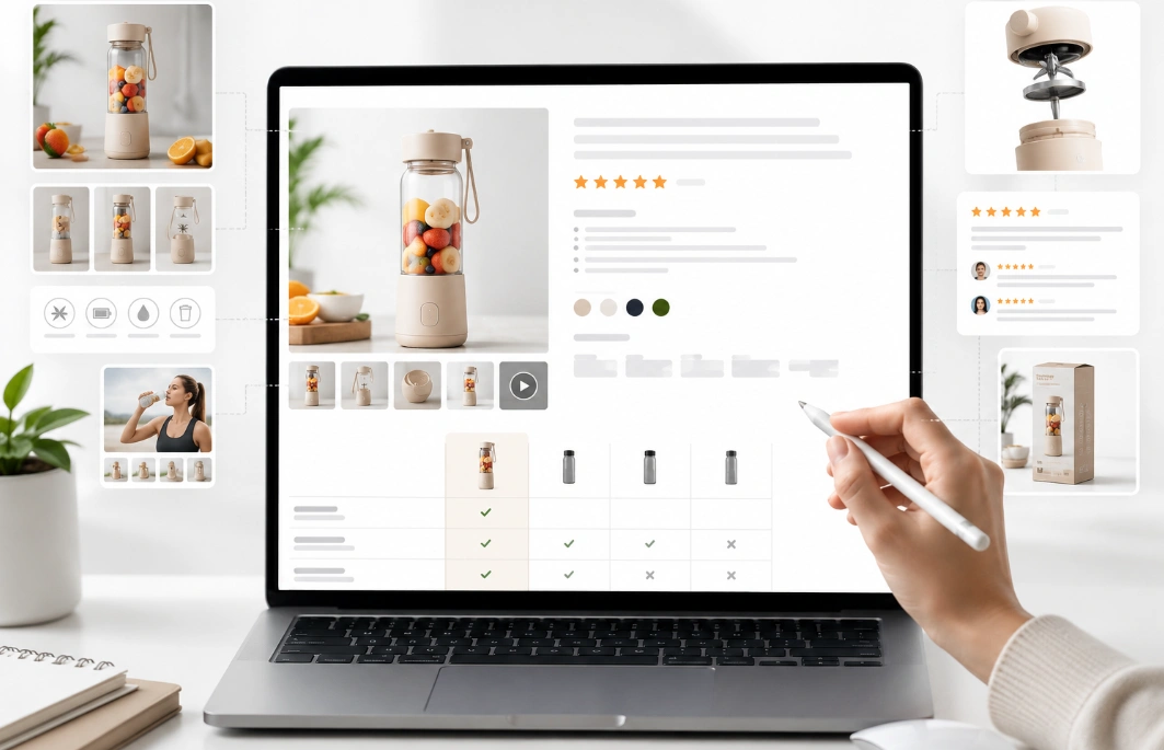
A shopper lands on your product page. They compare it against three rival tabs, then click away. Your plain listing lost the sale in seconds.
That first glance decides everything. Buyers judge trust from the images before they read a word. A cheap-looking page loses the order to a polished rival.
Knowing how to make your Amazon listing look more professional changes that. Sellers across the USA lose sales to better-looking pages each day. The product is fine, but the page fails to earn trust.
Most guides just say to optimize the listing. A professional Amazon listing instead looks trustworthy in every part. Let us begin with what professional means to a buyer.
What Makes an Amazon Listing Look Professional?
An Amazon listing looks professional when every part matches in quality. A professional listing reads as one clean unit to a shopper. That consistency signals real retail readiness behind the product.
Professional design means sharp photos, clear benefits, and full product details. It also means correct offer information and mobile-ready visuals. Consistent Amazon product page design keeps every part on message. High ecommerce listing quality shows across the product detail page.
Amateur pages break that trust with blurry photos or thin copy. Strong Amazon listing design keeps every element at the same standard. Better visual trust and listing quality raise buyer confidence.
Buyers seldom name the problem, yet they feel the gap. A page that looks cheap lowers shopping confidence before the price. The next section gives the fast answer sellers ask for first.
How Do You Make a Listing Look Professional? The Quick Answer
You make a listing look professional by fixing the images, copy, and mobile view. A clean main image and clear bullets carry most of the first impression. Professional Amazon listing optimization services fix product image and copy issues.
Good Amazon product page design treats the page as one connected story. A shopper should grasp the product within the first screen. Good Amazon conversion design lifts both trust and the conversion rate.
The seven upgrades below move from most visible to least. Each one adds a trust signal that a rival page may lack. First comes the image stack that shoppers see first.
7 Upgrades That Make Your Amazon Listing Look Professional
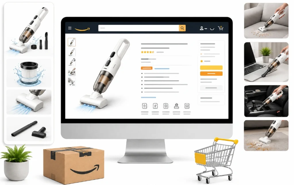
Seven upgrades turn a plain page into a professional Amazon listing that converts. Each one below fixes a common trust gap. The first upgrade sits in the image most shoppers judge first.
A clean main image that meets the rules
The main image sets the first impression, so it must meet Amazon’s strict rules. Its background must be pure white at RGB 255-255-255. The product must fill at least 85% of the frame.
A file of 1600 pixels or more turns on the zoom feature. Zoom lets a shopper inspect detail, which raises buyer confidence. Better product photos here beat any change lower on the page.
The main image cannot hold text, logos, or badges. A clean Amazon main image keeps the listing compliant and sharp. The next upgrade fills the slots behind that hero shot.
A full image stack that answers questions
Secondary images answer the questions a shopper asks before buying. You get seven or more slots after the main image. Weak slots repeat the Amazon product image mistakes that cost a sale.
One lifestyle image shows the product in real use. A product scale image shows true size against a common object. One what’s included image lists every part in the box.
Amazon infographic images turn specs into simple visual callouts. Clear Amazon infographic images raise product education without extra reading. The next upgrade sharpens the words beside those photos.
A clear title and clean bullet points
A clear product title states the brand, type, and main feature. It should read in plain words a shopper scans in one second. Good Amazon title optimization places the key search term near the front.
Strong bullet points lead with the benefit, then give the spec. Each bullet should cover one feature without a wall of text. Tight Amazon bullet points answer a buyer question in a single line.
The product description or A+ Content explains use cases in plain language. Feature-benefit copy tells the shopper why each spec matters. The next upgrade replaces that plain text with richer modules.
A+ Content that builds the brand
A+ Content replaces the plain description with enhanced images and structured modules. Brand-registered sellers get it free after enrolling in Amazon Brand Registry. Strong Amazon A+ Content can lift the conversion rate by 5% to 15%.
The Brand Story module adds a banner that links to your other products. A+ Content is not indexed for search, so it works as a conversion lever. A comparison chart inside A+ helps a shopper pick the right model. The modules fill the Amazon product detail page below the fold.
Clean Amazon brand content signals a real business, not a random reseller. Consistent fonts and colors across modules build brand credibility. The next upgrade extends that brand feel beyond one page.
A storefront and video that add proof
A Brand Store gives your catalog a branded home with multiple pages. Shoppers who reach a store trust the brand more than a lone listing. A product video shows setup, size, and real use in motion.
A video near the image stack answers questions that photos cannot. Motion proof lowers doubt and lifts shopping confidence. Solid Amazon storefront design keeps the store and listings matched in style.
The store also aids product discovery across your whole catalog. A shopper who browses more pages sees more reasons to buy. The next upgrade makes all of this work on a phone.
A mobile view that stays clean
Most Amazon shoppers now browse on a phone, so the mobile view decides sales. The first screen on mobile must show the product and price at once. Short copy and readable text keep the choice quick.
A+ modules should stay legible when they shrink to a phone screen. Good mobile listing design puts the key benefit above the fold. Cramped text and tiny photos push mobile buyers away.
Bullet points should read without a pinch or a zoom. A clean mobile Amazon listing holds the sale to checkout. The next upgrade adds the trust signals buyers look for.
Trust signals that confirm a real brand
Trust signals confirm a real brand and push a hesitant shopper to buy. Product reviews and a strong star rating give social proof at a glance. A registered brand name and warranty add further customer trust.
Accurate offer details and offer quality protect trust at the last step. A clear price, Prime badge, and stock status set honest expectations. One fair pricing strategy keeps the Featured Offer and Buy Box stable.
Complete product details remove the doubt that stalls a purchase. Product detail accuracy keeps returns and complaints low. The next section shows the deeper image work behind these upgrades.
How to Improve Your Amazon Product Images

You improve product images by planning a sequence that answers buyer questions in order. Professional product photography starts with sharp light and true color. A clean set of Amazon product images can lift the conversion rate. Sharp images improve Amazon listing trust more than any copy edit.
The image order should move from the hero shot to proof shots. Lifestyle images and a product infographic cut the guesswork before purchase. Each photo should teach one clear fact about the product.
Consistent editing keeps every photo in the same visual style. Image consistency across the stack signals a careful brand. Solid Amazon listing optimization treats images and copy as one system. The next section turns to the words beside these images.
How to Write Copy That Looks Professional
You write professional copy by leading with benefits and backing them with specs. A clear product title and strong bullet points carry the scan. Clean copy and sharp Amazon product images work as one unit.
Search terms drive Amazon SEO in the title and bullets, not at random. One guide on how to optimize an Amazon listing shows where each keyword sits. Front-loaded benefits match how shoppers scan and hold attention longer.
The description should explain use cases in plain, honest words. A confident brand tone builds brand presentation without hype. One clear value proposition tells the shopper why to buy now. The next section upgrades that copy into richer modules.
Using A+ Content and Brand Story the Right Way
A+ Content works best when each module teaches one clear idea. The Brand Story module carries your mission and links related products. Well-built Amazon A plus content design raises trust and the conversion rate together.
A comparison chart helps a shopper choose between your own models. Amazon warns against off-site links or fake Amazon logos in A+ modules. Compliant Amazon A+ content design protects the listing from removal.
Premium A+ adds video and interactive modules at no extra cost now. Strong Amazon brand content turns a flat page into a guided decision. The next section extends that brand feel across a full store.
Building a Brand Store That Earns Trust
A Brand Store gives new brands a branded home with several linked pages. Shoppers trust a full store more than a lone listing. That trust carries over to every product inside it.
The store layout should match the fonts and colors of your listings. Guidance for new Amazon brands and storefronts shows how a store raises catalog trust. Banner artwork carries the first impression at the top.
Clean Amazon storefront design supports product discoverability across the catalog. A tidy grid guides a shopper from one product to the next. The next section shows how to prove which change works.
How to Test Listing Changes With Data
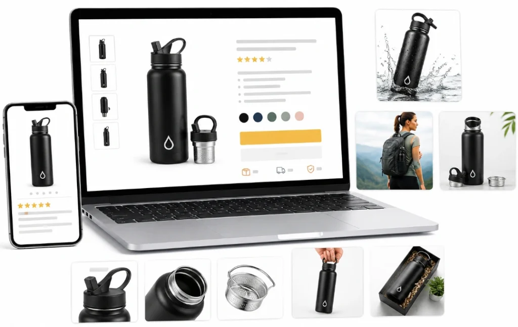
You test listing changes with data through Amazon’s Manage Your Experiments tool. It runs an A/B test that splits your traffic between two versions. The winning version can be published once the data settles.
Manage Your Experiments can test titles, bullets, and A+ Content. You can also test product images against each other for clicks. Some experiments have driven up to a 25% sales increase.
Content testing removes the guesswork from each listing choice. Ongoing Amazon product page optimization lifts sales performance over time. Strong conversion optimization comes from data, not opinion.
Unit session percentage tracks orders against unique visitors on the page. A rise there proves a change helped real shoppers. One better page also raises Amazon PPC conversion on the same spend. The table below sorts an amateur page from a professional one.
Amateur vs Professional: What Buyers Notice
A professional page differs from an amateur one in a few visible ways. Each row below marks a signal a shopper reads in seconds. The gap decides which listing earns the click.
Element | Amateur look | Professional look |
Main image | Off-white, small product | Pure white, 85% fill |
Secondary images | One or two photos | Full stack with infographics |
Copy | Vague, keyword-stuffed | Benefit-led and clear |
Description | Plain text block | A+ Content modules |
Mobile view | Cramped and long | Clean first screen |
A professional look matches on every row, not just the main image. One weak row can still break buyer confidence. The next section handles pages that fail on mobile or get hidden.
How to Fix Mobile and Suppressed Listing Problems
A page can look professional and still fail on a phone or get hidden. The first mobile screen must show the product and price without a scroll. Cramped modules and tiny text push mobile buyers away.
Mobile view decides most sales, since most shoppers now browse on a phone. Steps to fix suppressed listings on Amazon restore a page an image hid. A suppressed listing earns zero trust because no one can find it.
Clean mobile listing design keeps bullets readable without a pinch. A smooth mobile shopping experience holds the sale to checkout. The next section turns this work into a short plan.
A 7-Day Listing Polish Plan
A seven-day plan fixes the biggest trust gaps in a clear order. Each day has one focus that a new seller can finish. This structure stops the random edits that waste time.
- Day 1 reshoots the main image to hit 85% fill on white.
- Day 2 builds the secondary image stack with infographics.
- Day 3 rewrites the title and bullet points for clarity.
- Day 4 publishes A+ Content with a Brand Story module.
- Day 5 checks the whole page on a phone screen.
- Day 6 adds reviews, warranty, and accurate offer details.
- Day 7 starts an A/B test in Manage Your Experiments.
A plan like this shows visible progress within one week. Steady work here compounds into real Amazon sales growth. The next section lists the mistakes that undo this effort.
How Our Team Builds Professional Amazon Listings
Our team has designed professional Amazon listings for over 10 years. We start each page with an image plan and a copy rewrite. From there, we add A+ Content and a store test.
Careful Amazon product page optimization raises the conversion rate within weeks. One client lifted sales after we replaced a plain description with A+ modules. Clean design turned a cheap-looking page into a trusted one.
You can reach out to our team for a free listing design review. We review images, copy, and mobile view in one pass. A short message shows where your page loses buyer trust.
Common Amateur Mistakes That Cheapen a Listing
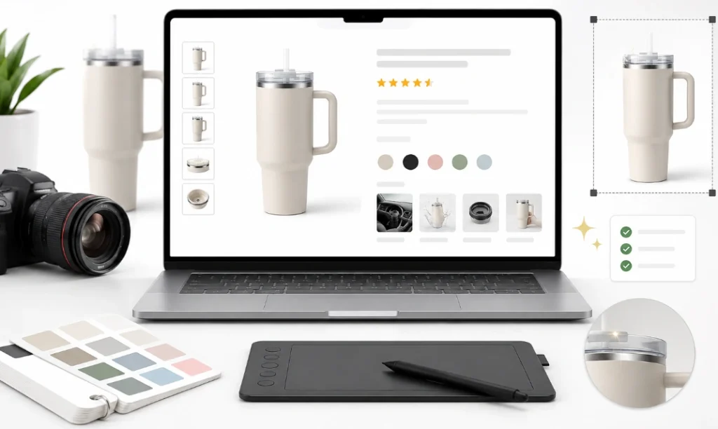
Most cheap-looking listings repeat a short list of avoidable mistakes. Each one below breaks a clear trust signal. Removing them lifts the whole page at once.
- A main image with text, a logo, or an off-white background.
- Only one or two low-resolution product photos.
- A title stuffed with keywords that no shopper reads.
- A plain description where A+ Content should sit.
- Bullet points that run long and bury the benefit.
- A mobile view that hides the price below the fold.
Weak banner art ranks among these Amazon storefront banner design mistakes to avoid. Strong Amazon listing optimization removes these gaps in a single pass.
A short audit before launch catches most of these errors. Clean fixes here lift the whole page at once. The next section shows how a team handles the rebuild.
Frequently Asked Questions (FAQs)
New sellers ask some questions about listing design. The short answers below match the most common cases. Each answer names the cause and the first move.
How do I make my Amazon listing look more professional?
You upgrade the images, copy, and A+ Content as one set. A clean main image and clear bullets carry most of the first impression.
Does A+ Content increase conversions?
Yes, A+ Content can lift the conversion rate by 5% to 15%. It replaces plain text with images and modules that build trust.
What are the Amazon main image rules?
The main image needs a pure white background and 85% product fill. A file of 1600 pixels or more turns on the zoom feature.
Do I need Brand Registry for A+ Content?
Yes, A+ Content and Brand Story are free once you enroll in Brand Registry. Brand Registry itself requires an active registered trademark.
How many product images should a listing have?
A strong listing uses the main image plus five to seven secondary images. Each secondary image should answer one buyer question.
How do I test which listing version works better?
You run an A/B test in Amazon's Manage Your Experiments tool. It splits traffic and shows which version drives more sales.
Turn a Plain Page Into a Trusted One
Knowing how to make your Amazon listing look more professional comes down to consistency. Every part of the page must match in quality and message. One weak image or thin bullet can still lose the sale.
You fix the main image first, then build the full image stack. Clear copy, A+ Content, and a clean mobile view come next. Trust signals and honest offer details close the gap.
Clean Amazon conversion design turns a plain page into a trusted one. Steady product page polish helps increase Amazon sales over time. Strong Amazon listing design rewards the seller who polishes every part. A tested, professional page today protects the sales you earn tomorrow.
